Metro-(gnome)

Metronome

This is the first installment in my collection (o)-bjects. The original idea was to practice drawing somewhat intricate icons. Later, I came up with the idea to contrast the simplicity of the line drawings with whimsical title styling. Probably unnecessary, but I went with the idea nonetheless.

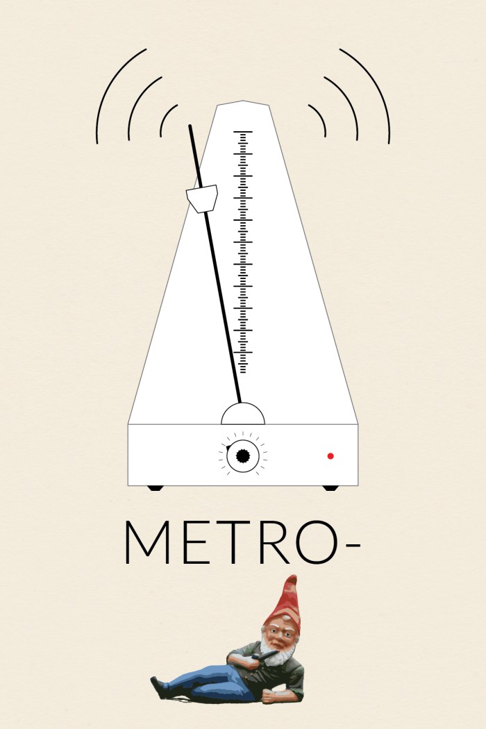
Nothing fancy about the metro-(gnome) body. The scale was created using a brush. I made a small brush and then applied the pattern to a 1-point line. I made the textured knob by modifying the procedure I found in a Lynda.com tutorial, which showed how to make a gear. I brought the gnome into Illustrator and then used Live Trace to get the painted look. It took a fair amount of cleanup to smooth out the edges and delete the background.

The original inspiration for this icon (and the series) was this ruler I found and pinned onto one of my Pintrest boards.

Ruler


Image Source: The wonderful gnome picture came from Wikipedia.
Blen%na@_e&}h#$e’*[&r”&R

Blender

This is the third installment in my collection (o)-bjects. The original idea was to practice drawing somewhat intricate icons. Later, I came up with the idea to contrast the simplicity of the line drawings with whimsical title styling. Probably unnecessary, but I went with the idea nonetheless.

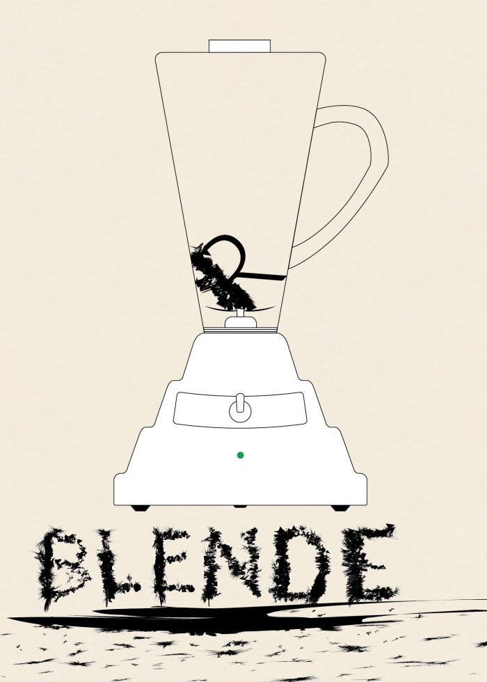
To give the body of the blender the undulating curve look I saw in photos I used Sato’s Round Any Corner script. Somewhere along the way I had the idea of making the letters look like they had been blended. I first wrote out the word “Blender,” then expanded it and worked on each letter individual. I took a rectangle and modified it using Roughen.

Screen Shot 2014-03-02 at 3.11.27 PM

I used Minus Front to get small sections of each letter and then used a variety of effects.Screen Shot 2014-03-02 at 3.15.28 PMI used a variety of effects to get different looks. Mainly Zig Zag, Roughen, Tweak, Warp, and Twist. Below various versions of these effects are shown for the ‘B.’ I then layered the effects to get the final product.


Screen Shot 2014-03-02 at 12.33.08 PM

Screen Shot 2014-03-02 at 2.50.48 PM

(beet)-Box

Boombox

This is the third installment in my collection (o)-bjects. The original idea was to practice drawing somewhat intricate icons. Later, I came up with the idea to contrast the simplicity of the line drawings with whimsical title styling. Probably unnecessary, but I went with the idea nonetheless.

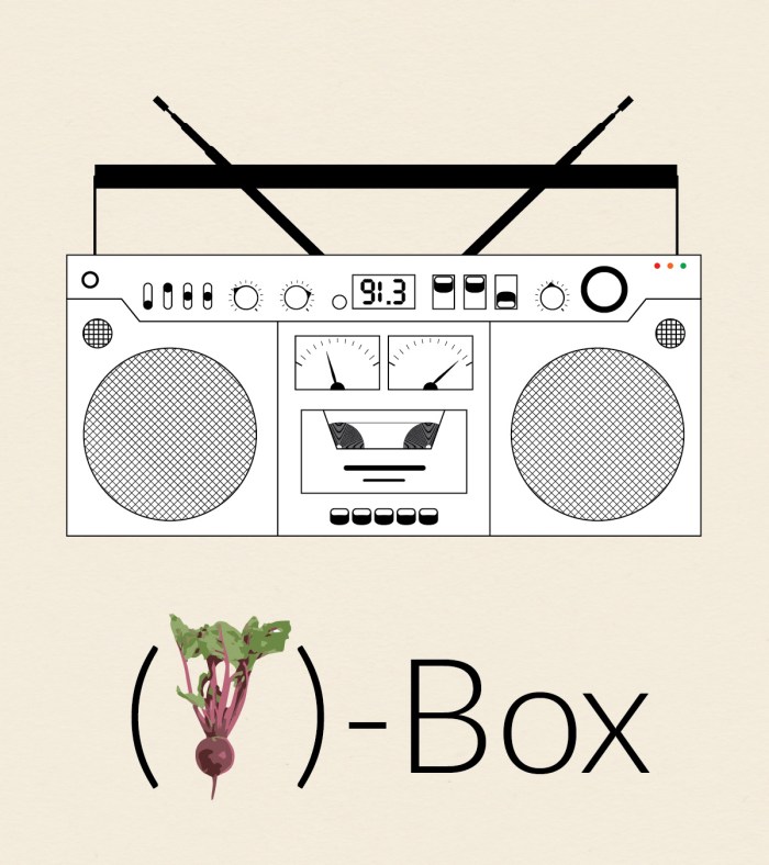
I guess technically this is a boombox, but I liked the idea of calling it a beatbox so I could use a picture of a beet, which seems somewhat less expected. The creation of (beet)-Box utilized Illustrator’s repeating pattern functionality. For instance, the tape inside the deck is a series of tightly spaced concentric circles and speakers are made from repeating straight lines that at then masked out into circles.

Photo Credit: The picture of the beet comes from (the wonderful?) Interpretation of Dreams site. Because we all dream about beets pretty regularly. I’m guessing they themselves got the photo from another site unless they employ a cadre of in-house photographers to take pictures of beets (they have 12 beet pictures!!!!). However, I couldn’t find the original image source.

Old Fashion

Old Fashioned Short


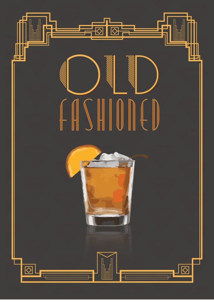
In honor of my friend Graham who loves a good Old Fashioned, I made this decorative poster. The drink itself I imported and converted using Live Trace. I reflected it and used a gradient to get the reflection, and did a little bit of blending work on the edge to make the reflection look more realistic. I used an opacity mask on the main lettering for “OLD” to get the repeating diagonal lines on the left side of the letter. The gold filigree on the border I drew by hand, which took a hot minute. I went online to try to get some idea of the Art Deco style and looked at the movie poster for the Great Gatsby. There is a faint repeating background using an ornamental shape I made. I originally intended the shape to be part of the border, but I think it turned out much better as is.