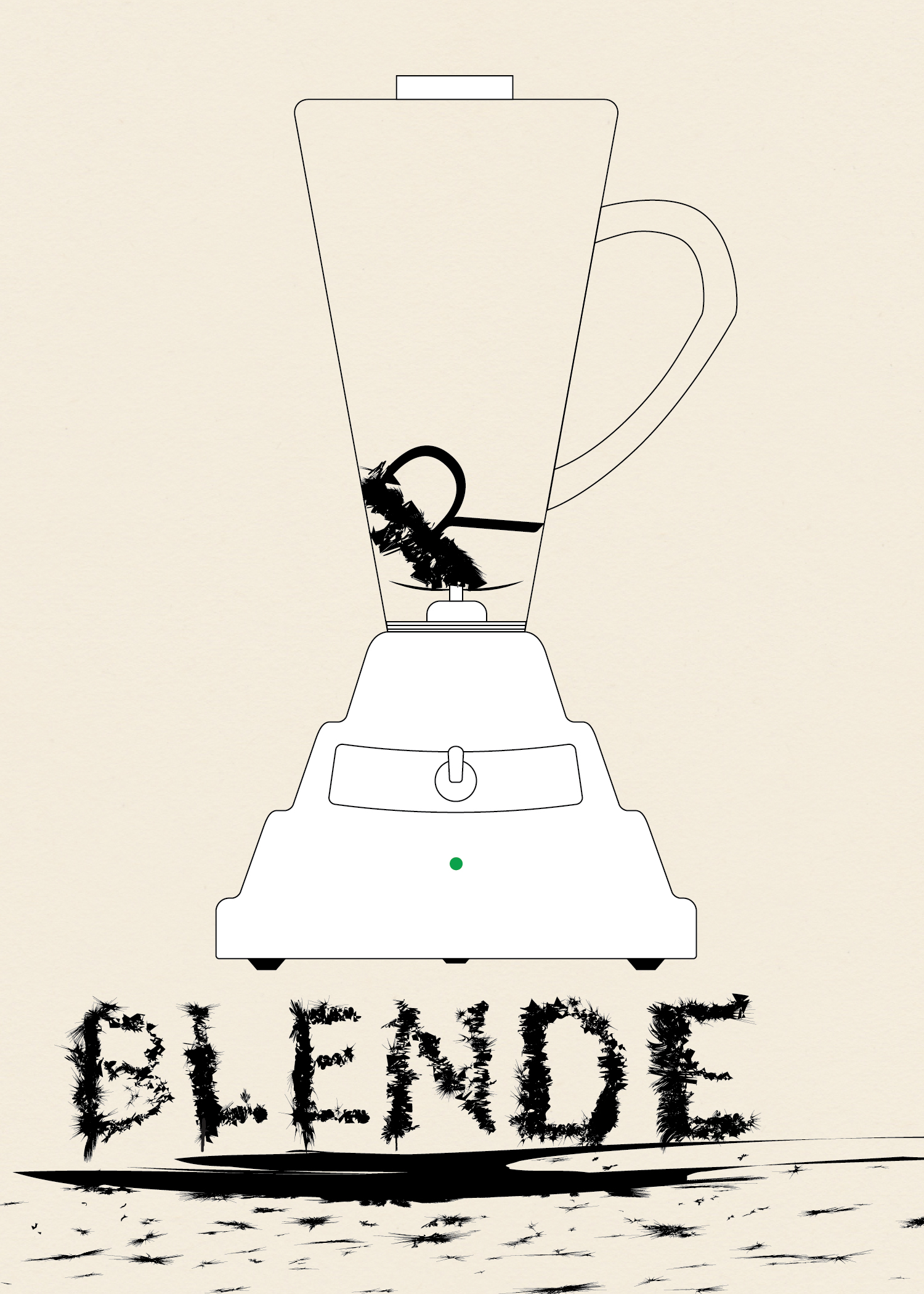
This is the third installment in my collection (o)-bjects. The original idea was to practice drawing somewhat intricate icons. Later, I came up with the idea to contrast the simplicity of the line drawings with whimsical title styling. Probably unnecessary, but I went with the idea nonetheless.
To give the body of the blender the undulating curve look I saw in photos I used Sato’s Round Any Corner script. Somewhere along the way I had the idea of making the letters look like they had been blended. I first wrote out the word “Blender,” then expanded it and worked on each letter individual. I took a rectangle and modified it using Roughen.
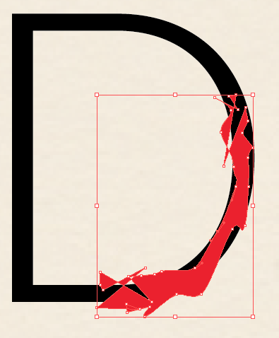
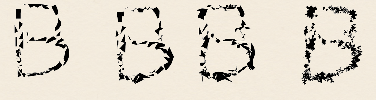
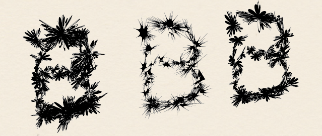
I used Minus Front to get small sections of each letter and then used a variety of effects.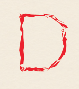 I used a variety of effects to get different looks. Mainly Zig Zag, Roughen, Tweak, Warp, and Twist. Below various versions of these effects are shown for the ‘B.’ I then layered the effects to get the final product.