(beet)-Box

Boombox

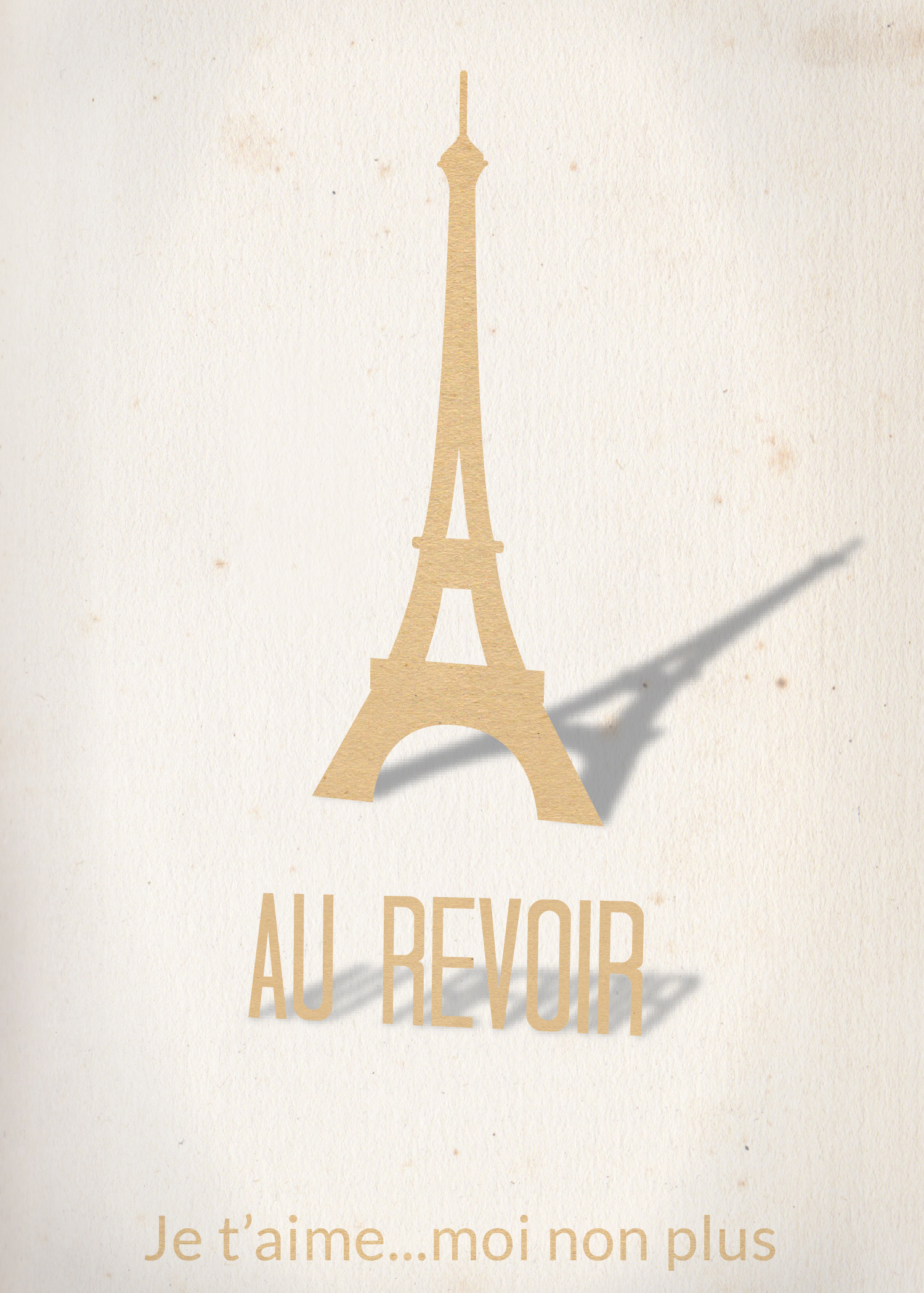
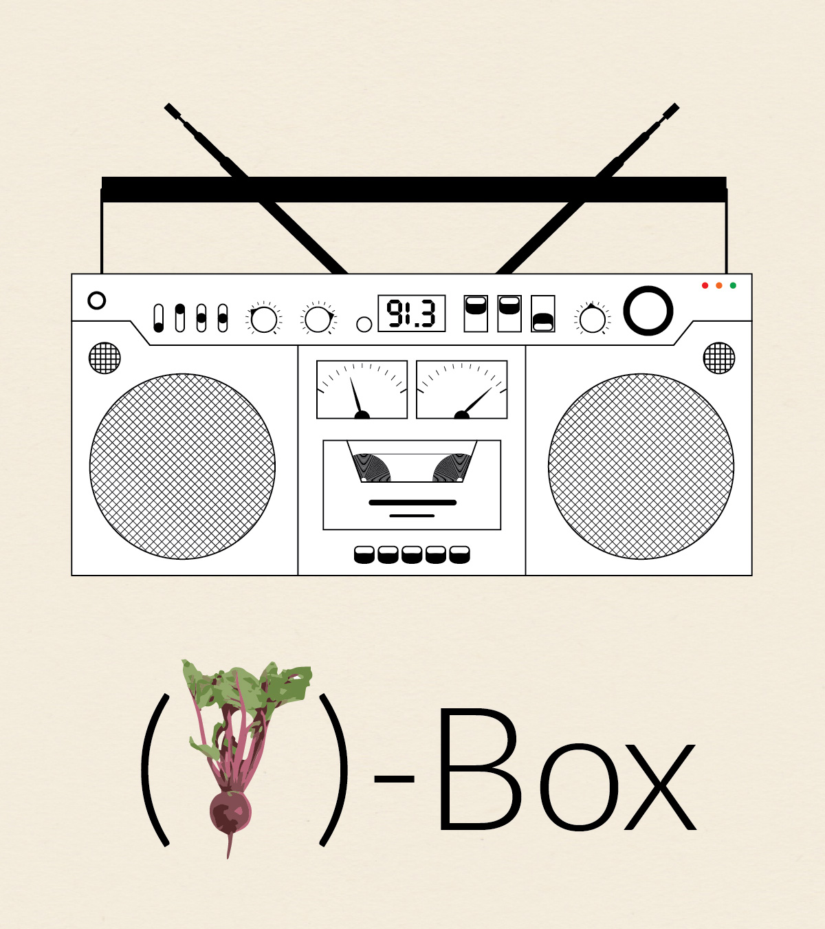
This is the third installment in my collection (o)-bjects. The original idea was to practice drawing somewhat intricate icons. Later, I came up with the idea to contrast the simplicity of the line drawings with whimsical title styling. Probably unnecessary, but I went with the idea nonetheless.

I guess technically this is a boombox, but I liked the idea of calling it a beatbox so I could use a picture of a beet, which seems somewhat less expected. The creation of (beet)-Box utilized Illustrator’s repeating pattern functionality. For instance, the tape inside the deck is a series of tightly spaced concentric circles and speakers are made from repeating straight lines that at then masked out into circles.

Photo Credit: The picture of the beet comes from (the wonderful?) Interpretation of Dreams site. Because we all dream about beets pretty regularly. I’m guessing they themselves got the photo from another site unless they employ a cadre of in-house photographers to take pictures of beets (they have 12 beet pictures!!!!). However, I couldn’t find the original image source.

Old Fashion

Old Fashioned Short


In honor of my friend Graham who loves a good Old Fashioned, I made this decorative poster. The drink itself I imported and converted using Live Trace. I reflected it and used a gradient to get the reflection, and did a little bit of blending work on the edge to make the reflection look more realistic. I used an opacity mask on the main lettering for “OLD” to get the repeating diagonal lines on the left side of the letter. The gold filigree on the border I drew by hand, which took a hot minute. I went online to try to get some idea of the Art Deco style and looked at the movie poster for the Great Gatsby. There is a faint repeating background using an ornamental shape I made. I originally intended the shape to be part of the border, but I think it turned out much better as is.

Au Revoir

I was inspired by a recent photo I pinned on Pintrest to make this Eiffel Tower cutout style card. I made the tower from scratch, a process I describe below, and used 3-D effects to get the perspective on the tower and main wording and their shadows. I used an opacity mask and a textured paper image to get the paper cutout effect. Finally, I added a very faint vignette. The font is called Tall Dark and Handsome and was chosen to match the height and narrowness of the tower. Here is the final result:
Card

Here is the original I found several months back that inspired me:

3d5f644f43511164d16bf410c0d0ebf4

I drew my Eiffel Tower from scratch, borrowing heavily from Kenneth Appiah’s version on The Noun Project and some photographs of the tower I found online. When making icons such as these I often draw the left half of the object using the Pen Tool and then reflect it by using the Reflection Tool and alt+clicking on a guide I keep in the center of the artwork. I then combine each section using Pathfinder functions (mostly Minus Front and Unite), building the tower from the ground up. Here are a couple of screenshots of the process:

Screen Shot 2014-03-30 at 1.47.51 PM

Screen Shot 2014-03-30 at 1.49.22 PMI wanted my tower to be slightly curvier than Ken’s, and a little bit taller and thiner. I also wanted an extra A-shaped cutout above the lower observation area. In fact there is no such cutout on the actual tower, instead this shape is created by the metal trusses. However, I wanted a little more texture to break up the solid black shadow. I also added slightly more detail to the main observation deck at the top of the tower. Here are my and Ken’s version together (mine is in red):

Screen Shot 2014-03-30 at 8.51.39 PM