I made this onesheet for my company using Adobe Illustrator and InDesign. We’ll be using it at the Tealium Digital Velocity conference next week.
Here is the front.

And here is the back.
I made this onesheet for my company using Adobe Illustrator and InDesign. We’ll be using it at the Tealium Digital Velocity conference next week.
Here is the front.
And here is the back.
Decision analysis is an important part of modern revenue management strategies for many businesses. One solution for analysis of decisions of smaller complexity is TreePlan, a plugin for Excel. I was required to use TreePlan in an Excel modeling class I took earlier this year to solved the “Kendell Lobster Case” in Bertsimas & Freund’s popular Data, Models, and Decisions.
After solving the case TreePlan’s output looks like this: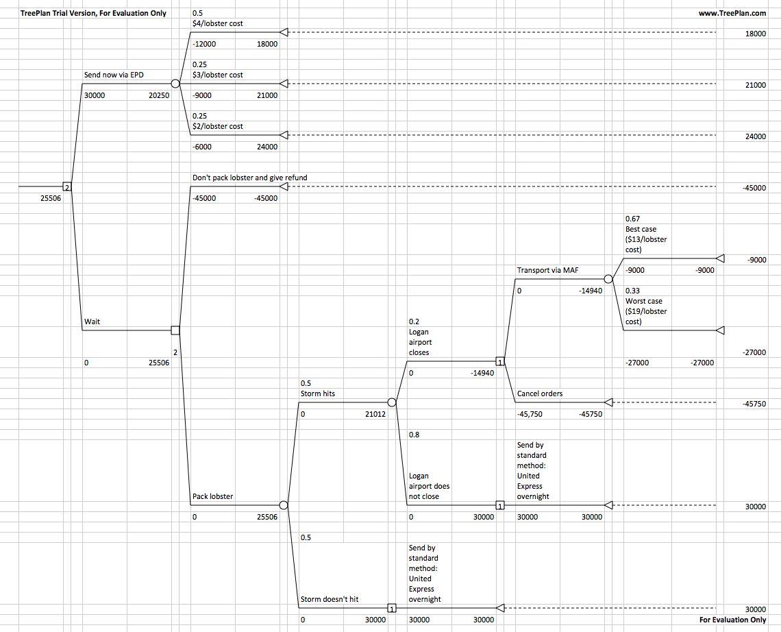
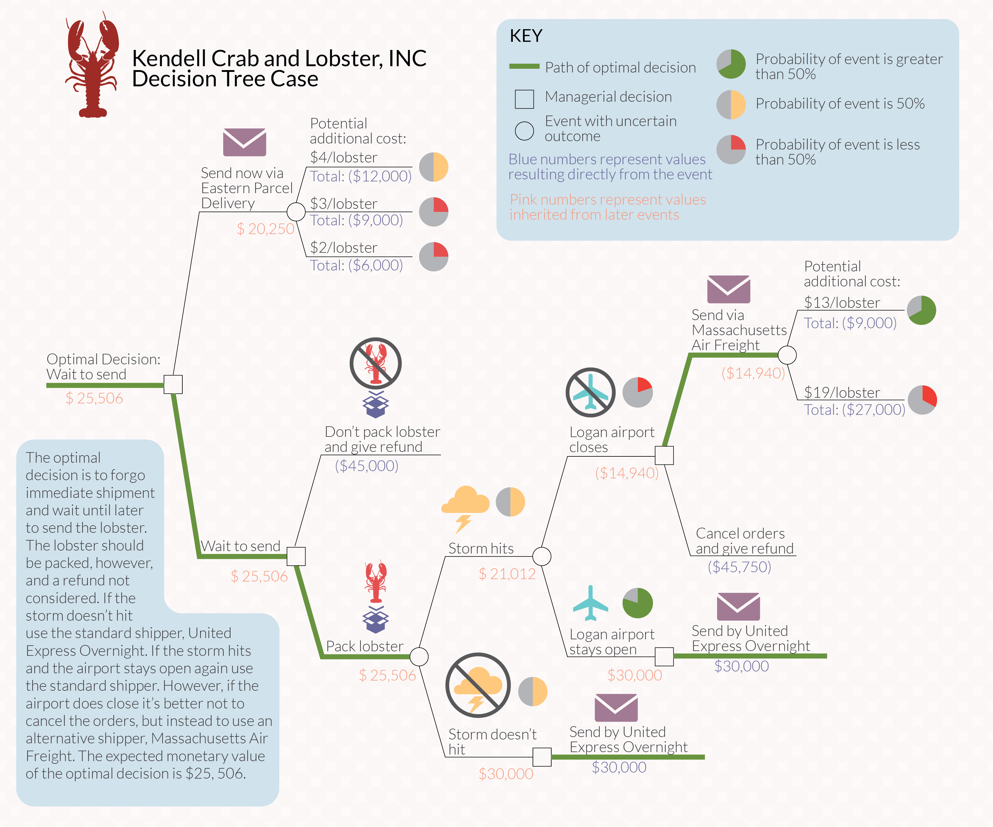
It’s usable, but doesn’t look great. So I took the output and designed a better looking solution using Adobe Illustrator:
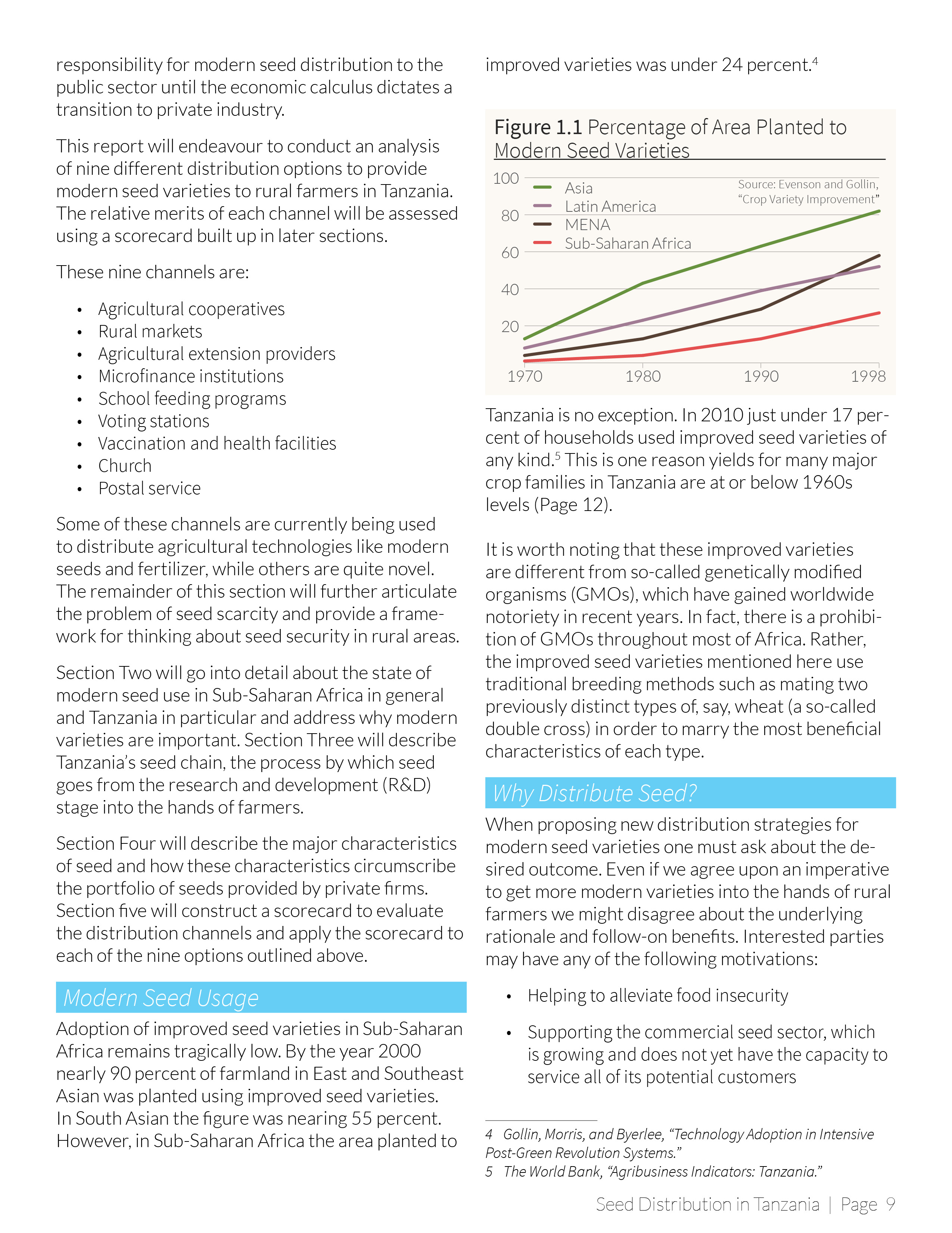
This is the introduction of my thesis, which was laid out using Adobe InDesign. The chapter header and graphs were created in Illustrator and imported into InDesign.

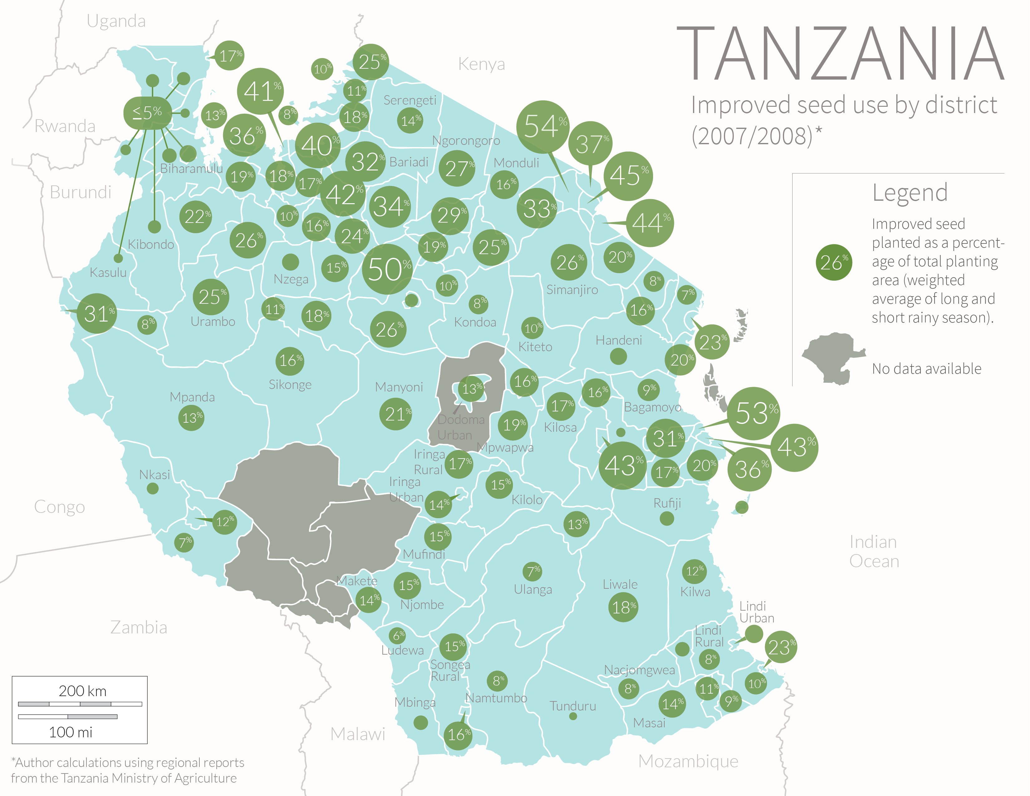
This is a map I created for my thesis on agriculture in Tanzania. The data shows the district variation in the area planted to modern seed varieties. The data is from a 2007-2008 agriculture survey conducted by the Ministry of Agriculture. I used an average of the area planted during the long and short rainy season weighted to account for the fact that most agricultural activity takes place during the long season.
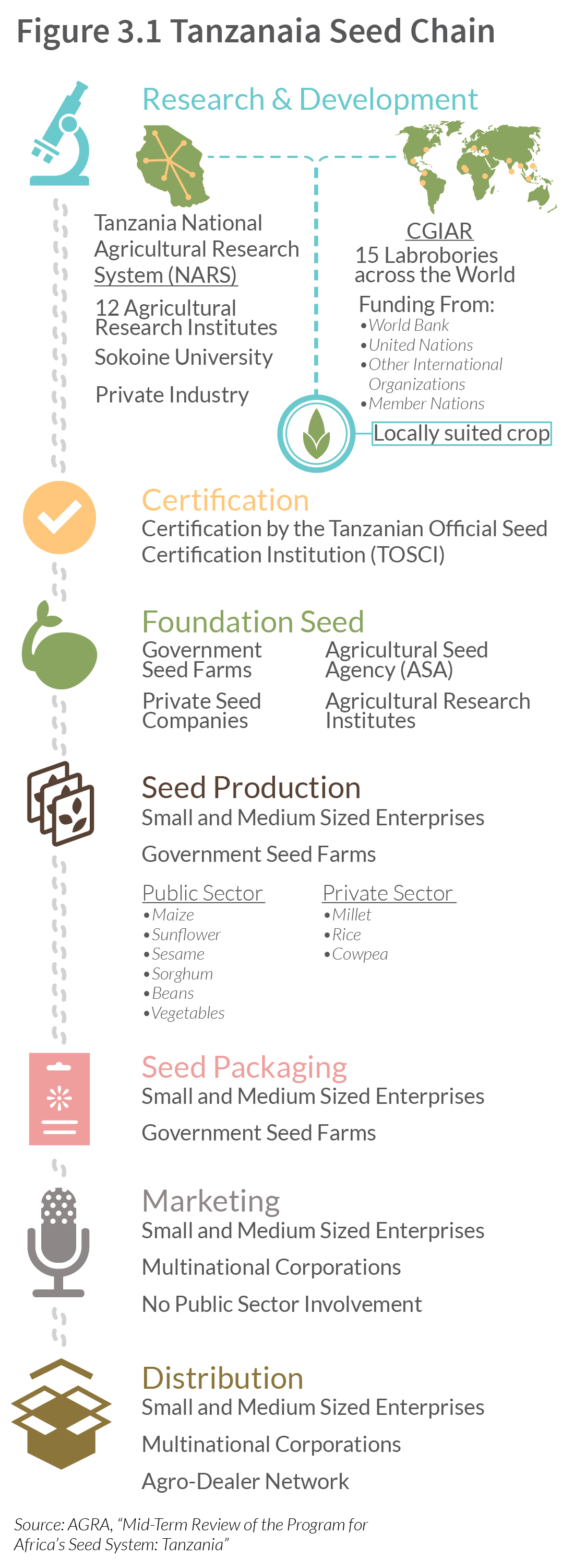
This is a detailed diagram from my thesis showing Tanzania’s formal seed chain.
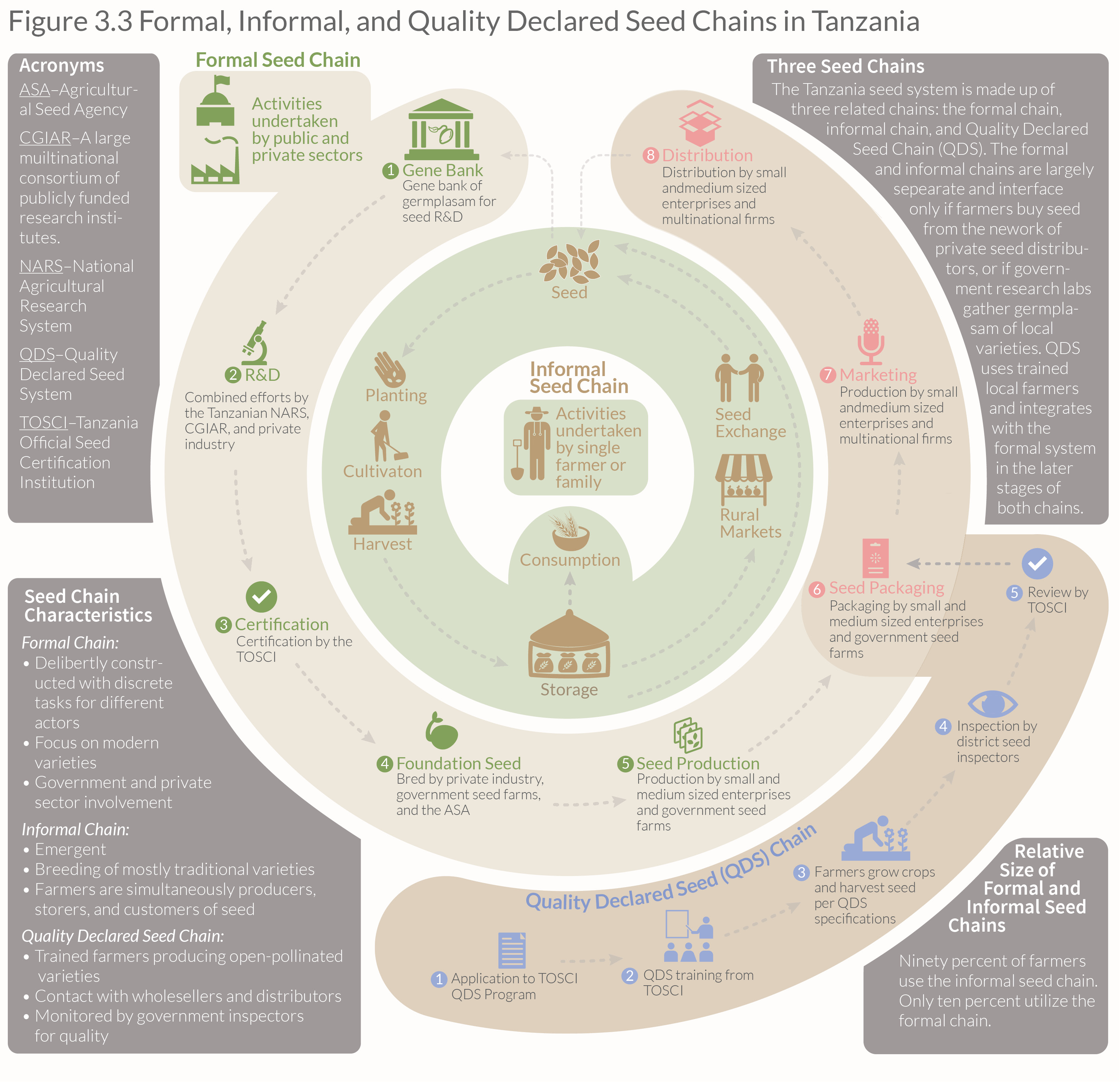
This is a chart I made for my thesis on agriculture in Tanzania describing the relationship between Tanzania’s three seed chains. The chart was adapted from several sources and, although it looks simple, it took quite a while to come up with this shape that would depict the relationship between the three different seed system.
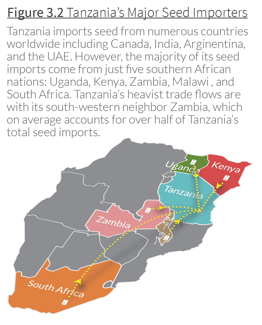
This is a map I created showing the main countries exporting seed to Tanzania. I wanted to give the map some depth so I used the 3-D features in Illustrator to give a sort of bird’s eye view of the region. I then placed the dotted lines and arrows individually. The subtle shadow effect was made by copying the lines and arrows and using a Gaussian blur. Illustrator has a built-in shadow effect, but it looks very wonky if you try to use it with curved lines. Making the shadows by hand gives much more control and the effect is much more polished.
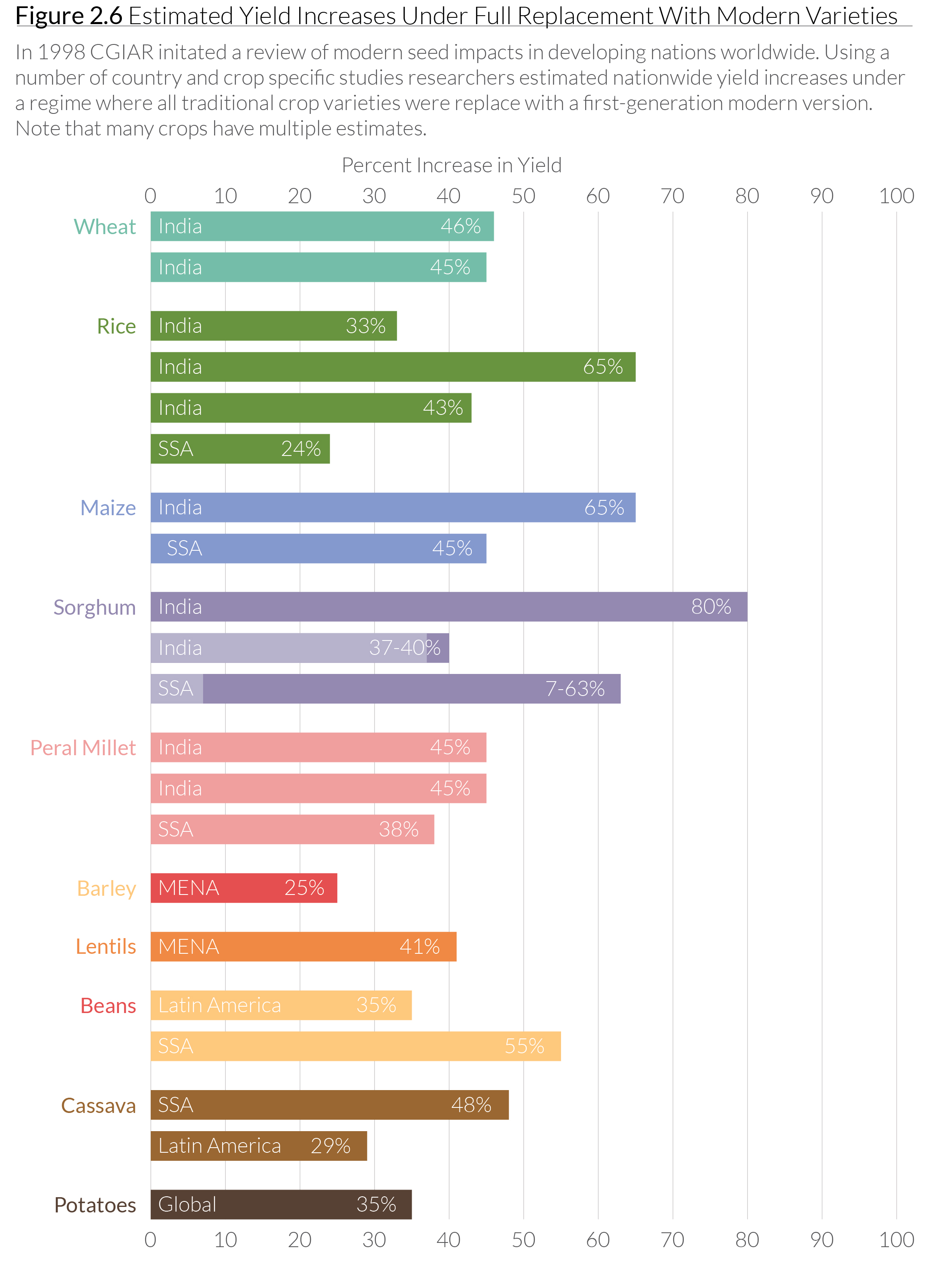 This is a chart I made using CGIAR data, which shows the improvement in yield for a variety of crops using so-called “modern seeds” (sometimes called “improved seeds”). These are non-GMO seed varieties cultivated by agronomists using traditional breeding techniques, but in a highly-controlled environment. I created this chart as part of my thesis on agriculture in Tanzania.
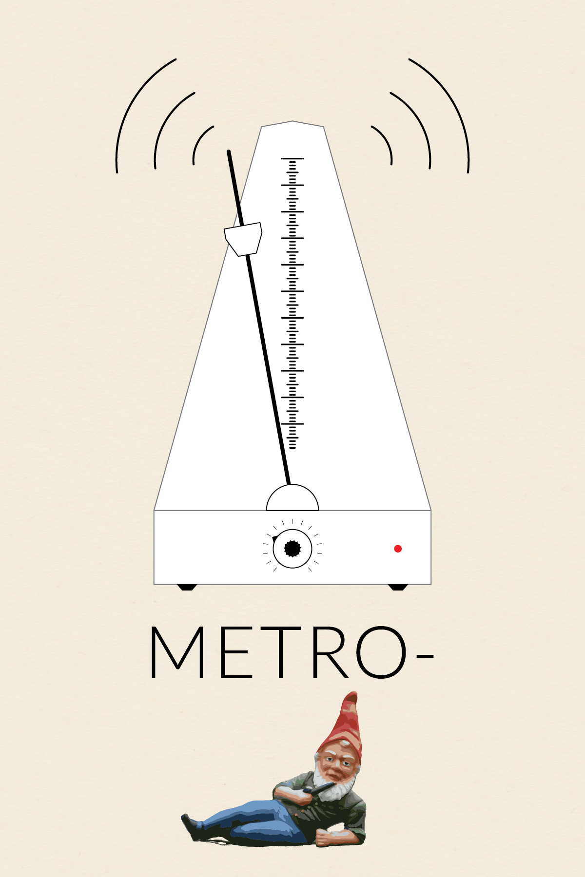
This is the first installment in my collection (o)-bjects. The original idea was to practice drawing somewhat intricate icons. Later, I came up with the idea to contrast the simplicity of the line drawings with whimsical title styling. Probably unnecessary, but I went with the idea nonetheless.
Nothing fancy about the metro-(gnome) body. The scale was created using a brush. I made a small brush and then applied the pattern to a 1-point line. I made the textured knob by modifying the procedure I found in a Lynda.com tutorial, which showed how to make a gear. I brought the gnome into Illustrator and then used Live Trace to get the painted look. It took a fair amount of cleanup to smooth out the edges and delete the background.
The original inspiration for this icon (and the series) was this ruler I found and pinned onto one of my Pintrest boards.
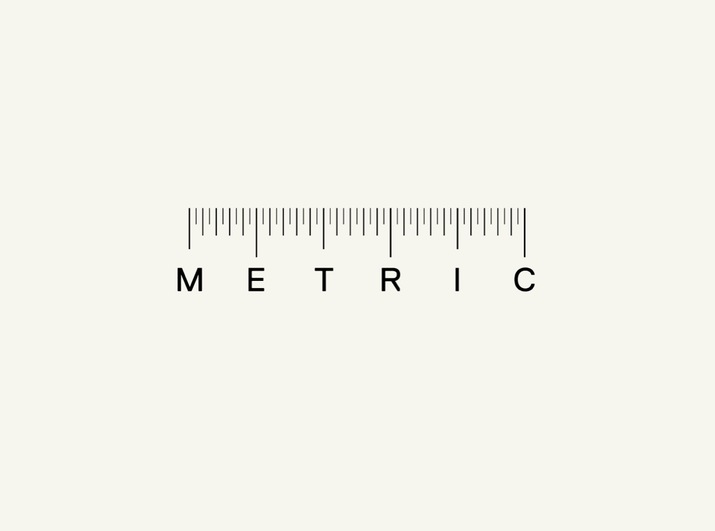
Image Source: The wonderful gnome picture came from Wikipedia.
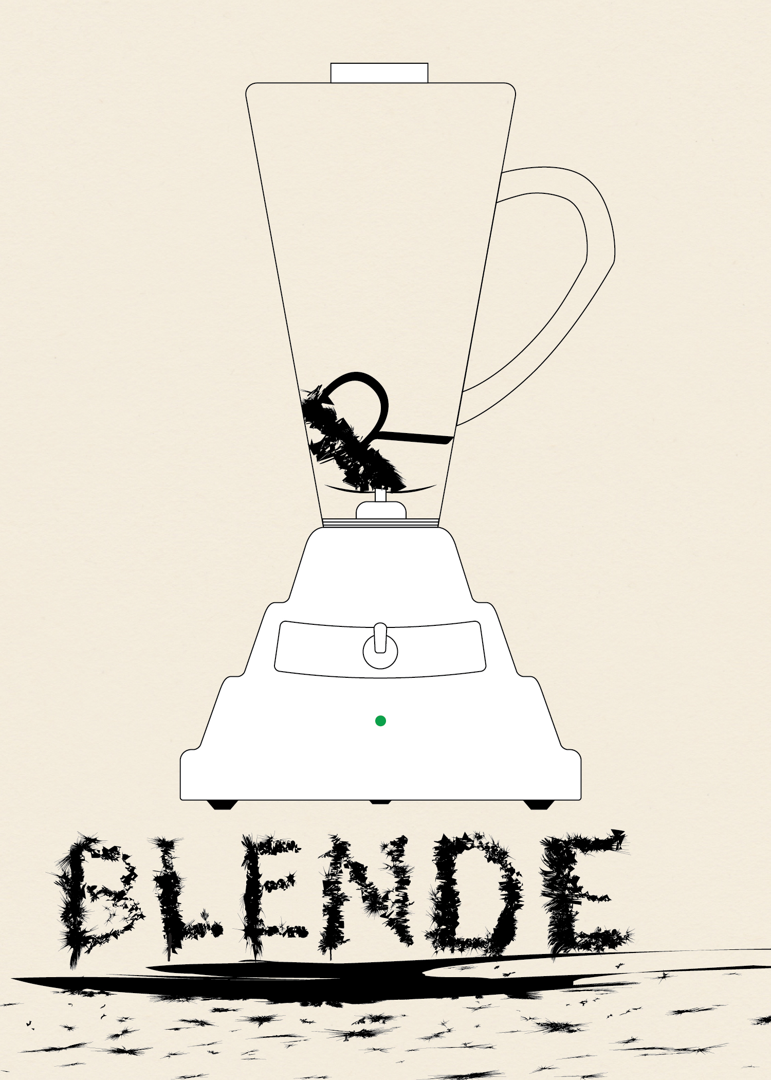
This is the third installment in my collection (o)-bjects. The original idea was to practice drawing somewhat intricate icons. Later, I came up with the idea to contrast the simplicity of the line drawings with whimsical title styling. Probably unnecessary, but I went with the idea nonetheless.
To give the body of the blender the undulating curve look I saw in photos I used Sato’s Round Any Corner script. Somewhere along the way I had the idea of making the letters look like they had been blended. I first wrote out the word “Blender,” then expanded it and worked on each letter individual. I took a rectangle and modified it using Roughen.
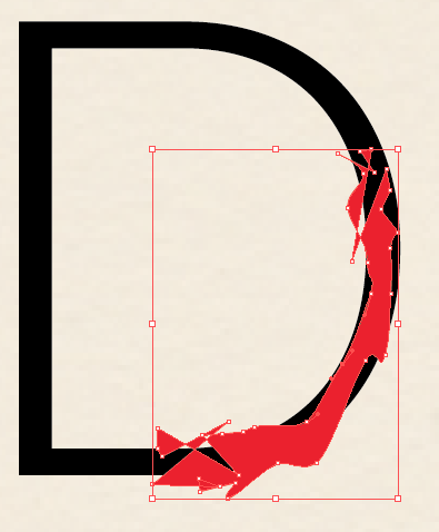
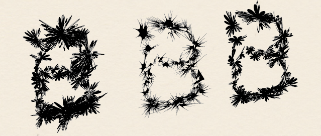
I used Minus Front to get small sections of each letter and then used a variety of effects. I used a variety of effects to get different looks. Mainly Zig Zag, Roughen, Tweak, Warp, and Twist. Below various versions of these effects are shown for the ‘B.’ I then layered the effects to get the final product.