
Splines are a popular way to fit data that allow for a good fit when the data has some sort of global curvature (see the graph below for an example). A cubic spline is a popular example. It allows for a cubic polynomial to be fit within some neighborhood between so-called “knots.” So for the graph below you might have a knot at age 0 and another knot at age 50, yet another knot at age 100, and so on. Within each segment of the data defined by these knots you fit a cubic polynomial. You then require that at the knot locations where the different polynomials meet they must join together in a smooth way (this is done by enforcing the first and second derivatives be equal at the knot).
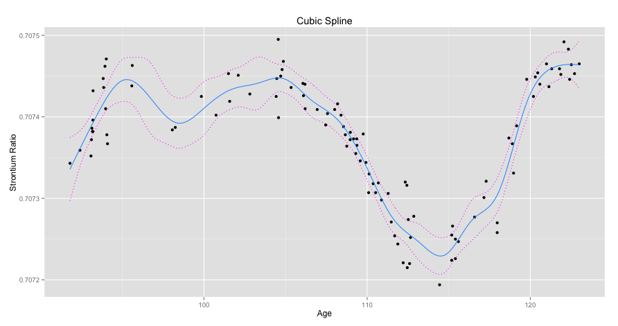
Below a spline with 20 evenly spaced knot locations is shown for some dummy data. I’ve also graphed a 95% confidence interval of the spline predictions in dotted red.
Here’s the code I used to produce it.
# Load libraries
library(reshape)
library(mgcv)
library(ggplot2)
library(data.table)

# Load data
setwd("Masked")
data <- read.csv(file = "Masked", header = TRUE)
attach(data)

# Create 20 evenly spaced knots
splitDistance <- (max(age) - min(age))/19
knots <- seq(min(age), max(age), by = splitDistance)

# Fit a penalized cubic regression spline with 20 evenly spaced
# knots using cross validation
model <- gam(strontium.ratio ~ s(age, k=20, fx=F, bs="cr", m=2),
data=data, family=gaussian, sp = .45, knots = list(age = knots))
# Predict points to plot data
plotPoints <- seq(min(age), max(age), by = .05)
yHat <- predict.gam(model, list(age = plotPoints), se.fit = TRUE)

# Create 95% confidence interval
upper95 <- yHat[[1]] + 1.96*yHat[[2]]
lower95 <- yHat[[1]] - 1.96*yHat[[2]]

# Prepare data for plotting
spline <- as.data.frame(cbind(plotPoints,yHat[[1]]))
setnames(spline,"V2","value")
CI <- as.data.frame(cbind(plotPoints,upper95,lower95))
CI <- melt(CI, id = "plotPoints",
variable_name = "Confidence.Interval")

# Plot data
ggplot() +
geom_point(data = data, aes(x = age, y = strontium.ratio)) +
geom_line(data=spline, aes(x = plotPoints, y = value),
colour = '#3399ff') +
geom_line(data=CI, aes(x = plotPoints, y = value,
group = Confidence.Interval),linetype="dotted",colour = '#ff00ff') +
ggtitle("Cubic Spline") +
xlab("Age") +
ylab("Strontium Ratio")
Created by Pretty R at inside-R.org
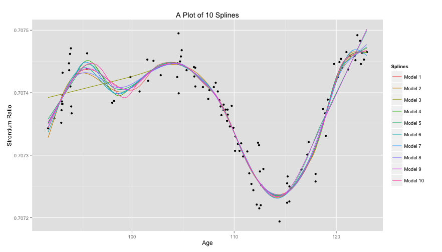
To show the effect of knot placement we can generate 20 random knot locations for multiple models and compare them. Since these are so-called natural splines linearity is enforced after the last knot. Here, Model 3 had it’s first knot generated quite far on the righthand side of the Age axis and so it’s linear to the left of that point.
Again, here’s the code.
# Create 10 models with random knot placement
set.seed(35)
models <- as.data.frame(lapply(1:10,
                        FUN = function(i) {
                        knots <- sort(runif(20, min(age),
                        max(age)))
                        model <- gam(strontium.ratio ~
                        s(age, k=20, fx=F, bs="cr", m=2),
                        data=data, family=gaussian,
                        method="GCV.Cp",
                        knots = list(age = knots))
                        return(predict(model,
                        list(age = plotPoints)))
                        }))

colnames(models) <- lapply(1:10,
                    FUN = function(i) {
                    return(paste("Model",i))
                    })

# Plot splines
models <- cbind(plotPoints, models)
models <- melt(models, id = "plotPoints", variable_name = "Splines")

ggplot() +
geom_point(data = data, aes(x = age, y = strontium.ratio)) +
geom_line(data = models, aes(x = plotPoints, y = value,
group = Splines, colour = Splines)) +
ggtitle("A Plot of 10 Splines") +
xlab("Age") +
ylab("Strontium Ratio")
