Fans of the daily ESPN show Pardon the Interruption (PTI) will be familiar with the co-host’s frequent “Population Theory.” The theory has a few formulations; it is sometimes asserted that when two countries compete in international football the country with the larger population will win, while at other times it’s stated that the more populous country should win.
The “Population Theory” sometimes also incorporates the resources of the country. So, for example, Kornheiser recently stated that the United States should be performing better in international football both because the country has a large population, but also because it has spent a large sum of money on its football infrastructure.
I decided to test this theory by creating a dataset that combines football scores from SoccerLotto.com with population and per capita GDP data from various sources. Because of the SoccerLott.com formatting the page wasn’t easily scraped by R or copied and pasted into Excel, so a fair amount of manual work was involved. Here’s a picture of me doing that manual work to breakup this text 🙂

The dataset included 537 international football games that took place between 30 June 2015 and 27 June 2016. The most recent game in the dataset was the shocking Iceland upset over England. The population and per capita GDP data used whatever source was available. Because official government statistics are not collected annually the exact year differs. I’ve uploaded the data into a public Dropbox folder here. Feel free to use it. R code is provided below.
Per capita GDP is perhaps the most readily available proxy for national football resources, though admittedly it’s imperfect. Football is immensely popular globally and so many poor countries may spend disproportionately large sums on developing their football programs. A more useful statistic might be average age of first football participation, but as of yet I don’t have access to this type of data.
Results
So how does Kornheiser’s theory hold up to the data? Well, Kornheiser is right…but just barely. Over the past year the more populous country has won 51.6% of the time. So if you have to guess the outcome of an international football match and all you’re given is the population of the two countries involved then you should indeed bet on the more populous country.
Of the 537 games, 81 occurred on a neutral field. More populous countries fared poorly on neutral fields, winning only 43.2% of the time. While at home the more populous country won 53.1% of their matches.
Richer countries fared even worse, losing more than half their games (53.8%). Both at home and at neutral fields they also fared poorly (winning only 45.8% and 48.1% of their matches respectively).
The best predictor of international football matches (at least in the data I had available) was whether the team was playing at home: home teams won 60.1% of the time.
To look more closely at population and winning I plotted teams that had played more than three international matches in the past year against their population. There were 410 total games that met this criteria. I also plotted a linear trend line in red, which as the figures above suggest, slopes upward ever so slightly.
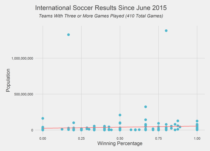
Although 527 games is a lot, it’s only a single year’s worth of data. It may be possible that this year was an anomaly and I’m working on collecting a larger set of data. As the chart above suggests many countries have a population around 100 million or less and so it would perhaps be surprising if countries with a few million more or fewer people had significantly different outcomes in their matches. But we can test this too…
When two countries whose population difference is less than 1 million play against one another the more populous country actually losses 55.9% of the time. When two countries are separated by less than 5 million people the more populous country wins slightly more than random chance with a winning percentage of 52.1%. But large population differences (greater than 50 million inhabitants) does not translate into more victories. They win just 51.2% of the time. So perhaps surprisingly the small sample of data I have suggests that population differences matter more when the differences are smaller (of course this could be spurious).
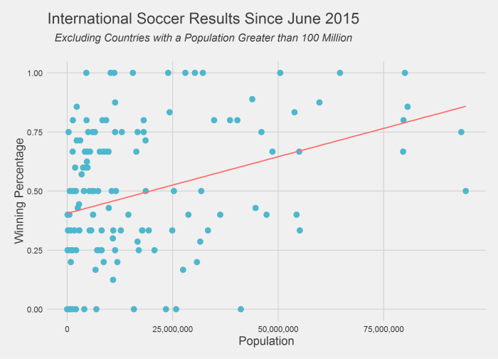
This can be further seen below in a slightly different view of the chart above that exchanges the axes and limits teams to those countries with less than 100 million people.
R code provided below:
###################################################################################################
# James McCammon
# International Football and Population Analysis
# 7/1/2016
# Version 1.0
###################################################################################################

# Import Data
setwd("~/Soccer Data")
soccer_data = read.csv('soccer_data.csv', header=TRUE, stringsAsFactors=FALSE)
population_data = read.csv('population.csv', header=TRUE, stringsAsFactors=FALSE)


################################################################################################
# Calculate summary data
################################################################################################
# Subset home field and neutral field games
nuetral_field = subset(soccer_data, Neutral=='Yes')
home_field = subset(soccer_data, Neutral=='No')

# Calculate % that larger country won
(sum(soccer_data[['Bigger.Country.Won']])/nrow(soccer_data)) * 100
# What about at neutral field?
(sum(nuetral_field[['Bigger.Country.Won']])/nrow(nuetral_field)) * 100
# What about at a home field?
(sum(home_field[['Bigger.Country.Won']])/nrow(home_field)) * 100

# Calculate % that richer country won
(sum(soccer_data[['Richer.Country.Won']])/nrow(soccer_data)) * 100
# What about at neutral field?
(sum(nuetral_field[['Richer.Country.Won']])/nrow(nuetral_field)) * 100
# What about at a home field?
(sum(home_field[['Richer.Country.Won']])/nrow(home_field)) * 100

# Calculate home field advantage
home_field_winner = subset(home_field, !is.na(Winner))
(sum(home_field_winner[['Home.Team']] == home_field_winner[['Winner']])/nrow(home_field_winner)) * 100

# Calculate % that larger country won when pop diff is less than 1 million
ulatra_small_pop_diff_mathes = subset(soccer_data, abs(Home.Team.Population - Away.Team.Population) < 1000000)
(sum(ulatra_small_pop_diff_mathes[['Bigger.Country.Won']])/nrow(ulatra_small_pop_diff_mathes)) * 100
#Calculate % that larger country won when pop diff is less than 5 million
small_pop_diff_mathes = subset(soccer_data, abs(Home.Team.Population - Away.Team.Population) < 5000000)
(sum(small_pop_diff_mathes[['Bigger.Country.Won']])/nrow(small_pop_diff_mathes)) * 100
#Calculate % that larger country won when pop diff is larger than 50 million
big_pop_diff_mathes = subset(soccer_data, abs(Home.Team.Population - Away.Team.Population) > 50000000)
(sum(big_pop_diff_mathes[['Bigger.Country.Won']])/nrow(big_pop_diff_mathes)) * 100


################################################################################################
# Chart winning percentage vs. population
################################################################################################
library(dplyr)
library(reshape2)

base_data =
  soccer_data %>%
  filter(!is.na(Winner)) %>%
  select(Home.Team, Away.Team, Winner) %>%
  melt(id.vars = c('Winner'), value.name='Team')

games_played =
  base_data %>%
  group_by(Team) %>%
  summarize(Games.Played = n())

games_won =
  base_data %>%
  mutate(Result = ifelse(Team == Winner,1,0)) %>%
  group_by(Team) %>%
  summarise(Games.Won = sum(Result))

team_results =
  merge(games_won, games_played, by='Team') %>%
  filter(Games.Played > 2) %>%
  mutate(Win.Perct = Games.Won/Games.Played)

team_results = merge(team_results, population_data, by='Team')

# Plot all countries
library(ggplot2)
library(ggthemes)
ggplot(team_results, aes(x=Win.Perct, y=Population)) +
  geom_point(size=3, color='#4EB7CD') +
  geom_smooth(method='lm', se=FALSE, color='#FF6B6B', size=.75, alpha=.7) +
  theme_fivethirtyeight() +
  theme(axis.title=element_text(size=14)) +
  scale_y_continuous(labels = scales::comma) +
  xlab('Winning Percentage') +
  ylab('Population') +
  ggtitle(expression(atop('International Soccer Results Since June 2015',
                     atop(italic('Teams With Three or More Games Played (410 Total Games)'), ""))))
ggsave('population_vs_winning_perct.png')

# Plot countries smaller than 100 million
ggplot(subset(team_results,Population<100000000), aes(y=Win.Perct, x=Population)) +
  geom_point(size=3, color='#4EB7CD') +
  geom_smooth(method='lm', se=FALSE, color='#FF6B6B', size=.75, alpha=.7) +
  theme_fivethirtyeight() +
  theme(axis.title=element_text(size=14)) +
  scale_x_continuous(labels = scales::comma) +
  ylab('Winning Percentage') +
  xlab('Population') +
  ggtitle(expression(atop('International Soccer Results Since June 2015',
                          atop(italic('Excluding Countries with a Population Greater than 100 Million'), ""))))
ggsave('population_vs_winning_perct_smaller.png')