Larry Wasserman presents an interesting simulation in Problem 11, Chapter 3 of All of Statistics. The problem asks you to simulate the stock market by modeling a simple random walk. With probability 0.5 the price of the stock goes down $1 and with probability 0.5 the stock prices goes up $1. You may recognize this as the same setup in our two simple random walk examples modeling a particle on the real line.
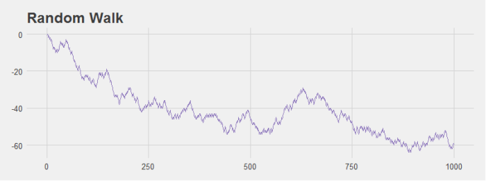
This simulation is interesting because Wasserman notes that even with an equal probability of the stock moving up and down we’re likely to see patterns in the data. I ran some simulations that modeled the change in stock price over the course of 1,000 days and grabbed a couple of graphs to illustrate this point. For example, look at the graph below. It sure looks like this is a stock that’s tanking! However, it’s generated with the random walk I just described.

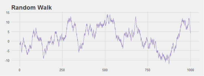
Even stocks that generally hover around the origin seem to have noticeable dips and peaks that look like patterns to the human eye even though they are not.

If we run the simulation multiple times it’s easy to see that if you consider any single stock it’s not so unlikely to get large variations in price (the light purple lines). However, when you consider the average price of all stocks, there is very little change over time as we would expect (the dark purple line).

Here is the R code to calculate the random walk and generate the last plot:
################################################################
# R Simulation
# James McCammon
# 2/20/2017
################################################################
# This script goes through the simulation of changes in stock
# price data.

# Load plotting libraries
library(ggplot2)
library(ggthemes)
library(reshape2)

#
# Simulate stock price data with random walk
#
    n = 1000 # Walk n steps
    p = .5 # Probability of moving left
    trials = 100 # Num times to repeate sim
    # Run simulation
    rand_walk = replicate(trials, cumsum(sample(c(-1,1), size=n, replace=TRUE, prob=c(p,1-p))))

#
# Prepare data for plotting
#
    all_walks = melt(rand_walk)
    avg_walk = cbind.data.frame(
      'x' = seq(from=1, to=n, by=1),
      'y' = apply(rand_walk, 1, mean)
    )

#
# Plot data
#
    ggplot() +
      geom_line(data=all_walks, aes(x=Var1, y=value, group=Var2), color='#BCADDC', alpha=.5) +
      geom_line(data=avg_walk, aes(x=x, y=y), size = 1.3, color='#937EBF') +
      theme_fivethirtyeight() +
      theme(axis.title = element_text()) +
      xlab('Days') +
      ylab('Change in Stock Price (in $)') +
      ggtitle("Simulated Stock Prices")