Stock Price Simulation

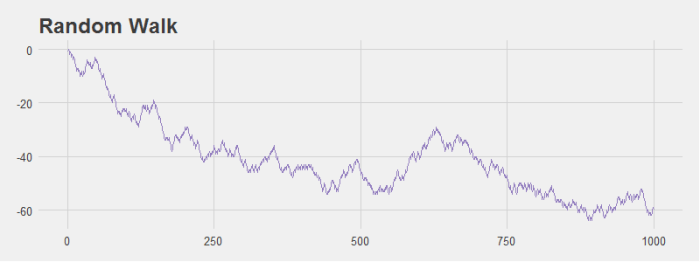
Larry Wasserman presents an interesting simulation in Problem 11, Chapter 3 of All of Statistics. The problem asks you to simulate the stock market by modeling a simple random walk. With probability 0.5 the price of the stock goes down $1 and with probability 0.5 the stock prices goes up $1. You may recognize this as the same setup in our two simple random walk examples modeling a particle on the real line.

This simulation is interesting because Wasserman notes that even with an equal probability of the stock moving up and down we’re likely to see patterns in the data. I ran some simulations that modeled the change in stock price over the course of 1,000 days and grabbed a couple of graphs to illustrate this point. For example, look at the graph below. It sure looks like this is a stock that’s tanking! However, it’s generated with the random walk I just described.

stock_plot1

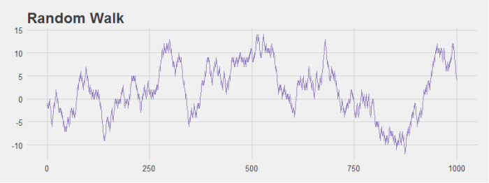
Even stocks that generally hover around the origin seem to have noticeable dips and peaks that look like patterns to the human eye even though they are not.

stock_plot2

If we run the simulation multiple times it’s easy to see that if you consider any single stock it’s not so unlikely to get large variations in price (the light purple lines). However, when you consider the average price of all stocks, there is very little change over time as we would expect (the dark purple line).

stock_plot3

Here is the R code to calculate the random walk and generate the last plot:

################################################################
# R Simulation
# James McCammon
# 2/20/2017
################################################################
# This script goes through the simulation of changes in stock
# price data.

# Load plotting libraries
library(ggplot2)
library(ggthemes)
library(reshape2)

#
# Simulate stock price data with random walk
#
    n = 1000 # Walk n steps
    p = .5 # Probability of moving left
    trials = 100 # Num times to repeate sim
    # Run simulation
    rand_walk = replicate(trials, cumsum(sample(c(-1,1), size=n, replace=TRUE, prob=c(p,1-p))))

#
# Prepare data for plotting
#
    all_walks = melt(rand_walk)
    avg_walk = cbind.data.frame(
      'x' = seq(from=1, to=n, by=1),
      'y' = apply(rand_walk, 1, mean)
    )

#
# Plot data
#
    ggplot() + 
      geom_line(data=all_walks, aes(x=Var1, y=value, group=Var2), color='#BCADDC', alpha=.5) +
      geom_line(data=avg_walk, aes(x=x, y=y), size = 1.3, color='#937EBF') +
      theme_fivethirtyeight() +
      theme(axis.title = element_text()) +
      xlab('Days') +
      ylab('Change in Stock Price (in $)') +
      ggtitle("Simulated Stock Prices")


Simple Random Walk – Method 2

Suppose we consider a simple random walk. A particle starts at initial position z_i and moves one unit to the left with probability p and moves one unit to the right with probability 1-p . What is the expected position \mathbb{E}[X_n] of the particle after n steps?

In a previous post I presented a method to solve this by iteration. I’d like to present a different method to solve the problem here.

Recall we have:

X_i = \bigg\{ \begin{tabular}{cc} p     & x = -1 \\ 1-p & x = 1 \end{tabular}

We give it some thought we can see that after n steps we’ve simply added up our random variables to get our final location. We could define a new random variable:

Y = \sum_{i=1}^{n} X_i

So now all we need to do is take the expected value of Y 
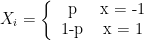
. We can use rules of expected value to bring the expectation inside the summation and take the expectation of each individual X_i as we normally would.

\mathbb{E}[Y] = \mathbb{E}\big[\sum_{i=1}^{n} X_i \big]
\mathbb{E}[Y] = \sum_{i=1}^{n} \mathbb{E}[X_i]
\mathbb{E}[Y] = \sum_{i=1}^{n} -1 \cdot p + 1 \cdot (1-p)
\mathbb{E}[Y] =  \sum_{i=1}^{n} 1 - 2p
\mathbb{E}[Y] = n(1 - 2p)

This is the same answer we got via the iteration method. This also makes our R simulation easier. Recall we has this setup:

################################################################
# R Simulation
################################################################
# Generate random walk
rand_walk = function (n, p, z) {
  walk = sample(c(-1,1), size=n, replace=TRUE, prob=c(p,1-p))
  for (i in 1:n) {
    z = z + walk[i]
  }
  return(z)
}

n = 1000 # Walk n steps
p = .3 # Probability of moving left
z = 0 # Set initial position to 0
trials = 10000 # Num times to repeate sim
# Run simulation
X = replicate(trials, rand_walk(n,p,z))

Our code now becomes:

################################################################
# R Simulation
################################################################
n = 1000 # Walk n steps
p = .3 # Probability of moving left
trials = 10000 # Num times to repeate sim
# Run simulation
X = replicate(trials, sum(sample(c(-1,1), size=n, replace=TRUE, prob=c(p,1-p))))

# Calculate empirical and theoretical results
empirical = mean(X)
theoretical = n*(1-2*p)
percent_diff = abs((empirical-theoretical)/empirical)*100

# print to console
empirical
theoretical
percent_diff

Notice that for our random walk we can replace this function:

rand_walk = function (n, p, z) {
  walk = sample(c(-1,1), size=n, replace=TRUE, prob=c(p,1-p))
  for (i in 1:n) {
    z = z + walk[i]
  }
  return(z)
}
X = replicate(trials, rand_walk(n,p,z))

With the simpler:

X = replicate(trials, sum(sample(c(-1,1), size=n, replace=TRUE, prob=c(p,1-p))))

Additionally, in this second method we don’t need to specify an initial position since we assume from the beginning it’s zero. Of course both methods complete the same task, but they use different conceptual models. The first uses an iteration model, while the latter completes the “iteration” in a single step.

Distribution Mean Convergence

Suppose we want to simulate \frac{1}{n}\sum_{i=1}^{n} X_i for X_1, X_2, \dots , X_n \sim N(0, 1) , n = 1, \dots , 10,000 . Suppose we want to do the same for the Cauchy distribution.
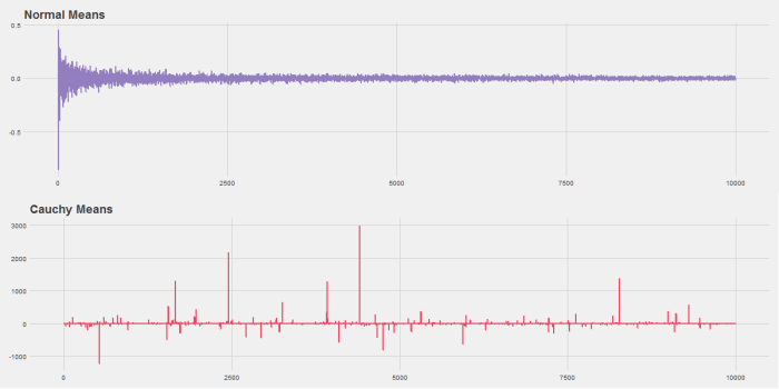
In other words, we want to draw several random variables from a normal distribution and then take the average. As n increases we should get closer to the mean of the distribution we’re drawing from, 0 in this case.

The R code below will do this. It produces this graph:
ch3-pr9

Notice that while the Normal distribution converges quickly the Cauchy never does. This is because the Cauchy distribution has fat tails and so extreme observations are common.

################################################################
# R Simulation
# James McCammon
# 2/20/2017
################################################################
# This script goes through the simulation of plotting both normal
# and Cauchy means for random vectors of size 1 to 10,000. It
# also demonstrates function creation and plotting.
# Highlight desired section and click "Run."

# Set working directory as needed
setwd("~/R Projects/All of Statistics")

###
# Calculate means and plot using base R
###

    # Set seed for reproducibility
    set.seed(271)
    
    #
    # Version 1: Simple
    #
    n = seq(from=1, to=10000, by=1)
    y=sapply(n, FUN=function(x) sum(rnorm(x))/x)
    plot(n, y, type="l")
    
    #
    # Version 2: Define a function
    #
    sim = function(x, FUN) {
      sapply(x, FUN=function(x) sum(FUN(x))/x)  
    }
    
    # Use function to plot normal means
    x = seq(from=1, to=10000, by=1)
    y1 = sim(x, rnorm)
    plot(x, y1, type="l")
    
    # Use function to plot Cauchy means
    y2 = sim(x, rcauchy)
    plot(x, y2, type="l")
    
    #
    # Version 3: More complex function
    #
    
    # This function has:
    # (1) error checking
    # (2) extra argument options
    # (3) the ability to input any distribution R supports
    sim = function(x, FUN, ...) {
      if(!is.character(FUN)) stop('Please enter distribution as string.')
      dists = c('rnorm',
                'rbeta',
                'rbinom',
                'rcauchy',
                'rchisq',
                'rexp',
                'rf',
                'rgamma',
                'rgeom',
                'rhyper',
                'rlnorm',
                'rmultinom',
                'rnbinom',
                'rpois',
                'rt',
                'runif',
                'rweibull')
      if(is.na(match(FUN, dists))) stop(paste('Please enter a valid distribution from one of:', paste(dists, collapse=', ')))
      FUN = get(FUN)
      sapply(x, FUN=function(x) sum(FUN(x, ...))/x)  
    }
    
    # We have to define our function in string form.
    # This will throw error 1.
    test1 = sim(x, rnorm)
    
    # We have to input a distribution R supports.
    # This will throw error 2.
    test2 = sim(x, 'my_cool_function')
    
    # We can input additional arguments like the
    # mean, standard deviations, or other shape parameters.
    test3 = sim(x, 'rnorm', mean=10, sd=2)

####
# Using ggplot2 to make pretty graph
###

    # Load libraries
    library(ggplot2)
    library(ggthemes)
    library(gridExtra)
    
    png(filename='Ch3-Pr9.png', width=1200, height=600)
    
      df1 = cbind.data.frame(x, y1)
      p1 = ggplot(df1, aes(x=x, y=y1)) + 
        geom_line(size = 1, color='#937EBF') + 
        theme_fivethirtyeight() +
        ggtitle("Normal Means")
      
      df2 = cbind.data.frame(x, y2)
      p2 = ggplot(df2, aes(x=x, y=y2)) + 
        geom_line(size = 1, color='#EF4664') + 
        theme_fivethirtyeight() +
        ggtitle("Cauchy Means")
      
      # Save charts
      grid.arrange(p1,p2,nrow=2,ncol=1)
      
    dev.off()
    # Print charts to screen
    grid.arrange(p1,p2,nrow=2,ncol=1)

Simple Random Walk – Method 1

Suppose we consider a simple random walk. A particle starts at initial position z_i and moves one unit to the left with probability p and moves one unit to the right with probability 1-p . What is the expected position \mathbb{E}[X_n] of the particle after n steps?

I will calculate the expected value using two different methods. The second method is simpler, but I’ll start using an iteration method.

Our PMF is:

f_X(x) = \bigg\{ \begin{tabular}{cc} p     & x = -1 \\ 1-p & x = 1 \end{tabular}

Let’s set our initial position as:
n=0: \quad \mathbb{E}[X_0] = z_i

After one step our expected position is then:
n=1: \quad \mathbb{E}[X_1] = (z_i - 1)p + (z_i + 1)(1 - p)
n=1: \quad \mathbb{E}[X_1] = z_{i}p - p + z_i + 1 - z_{i}p - p
n=1: \quad \mathbb{E}[X_1] = z_i + 1 - 2p

Great, let’s try iterating one more to see what we get. Note that at n=2 our position is now the result from n=1 , z_i + 1 - 2p .
n=2: \quad \mathbb{E}[X_2] = (z_i + 1 - 2p - 1)p + (z_i + 1 - 2p + 1)(1 - p)
n=2: \quad \mathbb{E}[X_2] = z_{i}p - 2p^2 + Z_i - 2p + 2 - z_{i}p + 2p^2 - 2p
n=2: \quad \mathbb{E}[X_2] = z_i + 2(1 - 2p)

If we keep iterating we will see that \mathbb{E}[X_n] = z_i + n(1 - 2p) . But we can prove this formally through induction. We’ve already done our base case, so let’s now do the induction step. We will assume that \mathbb{E}[X_n] = z_i + n(1 - 2p) is true and show that it is also true for n + 1 .

\mathbb{E}[X_{n+1}] = (z_i + n(1 - 2p) - 1)p + (z_i + n(1 - 2p) + 1)(1 - p)
\mathbb{E}[X_{n+1}] = (z_i + n - 2pn - 1)p + (z_i + n - 2pn + 1)(1 - p)
\mathbb{E}[X_{n+1}] = z_{i}p + pn - 2p^{2}n - p + z_i + n - 2pn + 1 -z_{i}p - pn + 2p^{2}n - p
\mathbb{E}[X_{n+1}] = - p + z_i + n - 2pn + 1 - p
\mathbb{E}[X_{n+1}] = z_i + (n + 1)(1 - 2p)

Thus our induction step holds and we have shown that \mathbb{E}[X_n] = z_i + n(1 - 2p) .

Because we chose our initial starting position z_i to be arbitrary, we might as well set it to 0 to obtain a final result of \mathbb{E}[X_n] = n(1 - 2p) .

Let’s take a moment to think about this result and make sure it seems reasonable. Suppose p = 0.5 . This would mean we have an equal chance of moving left or moving right. Over the long run we would expect our final position to be exactly where we started. Plugging in p = 0.5 to our equation yields n(1 - 2 \cdot 0.5) = n(1 - 1) = 0 . Just as we expected! What if p = 1 ? This means we only move to the left. Plugging p = 1 into our equation yields n(1 - 2 \cdot 1) = n(-1) = -n . This makes sense! If we can only move to the left then after n steps we would expect to be n steps left of our staring position (the origin as we chose it), the negative direction in our problem setup. We could also choose p to be 0, meaning we only move to the right and we would get n , again just what we would expect!

We can also run a simulation in R to verify our results:

################################################################
# R Simulation
################################################################
# Generate random walk
rand_walk = function (n, p, z) {
  walk = sample(c(-1,1), size=n, replace=TRUE, prob=c(p,1-p))
  for (i in 1:n) {
    z = z + walk[i]
  }
  return(z)
}

n = 1000 # Walk n steps
p = .3 # Probability of moving left
z = 0 # Set initial position to 0
trials = 10000 # Num times to repeate sim
# Run simulation
X = replicate(trials, rand_walk(n,p,z))

# Calculate empirical and theoretical results
empirical = mean(X)
theoretical = n*(1-2*p)
percent_diff = abs((empirical-theoretical)/empirical)*100

# print to console
empirical
theoretical
percent_diff

Printing to the console we see that after 10,000 trials of 1,000 steps each our empirical and theoretical results differ by just 0.046%.

> empirical
[1] 400.1842
> theoretical
[1] 400
> percent_diff
[1] 0.0460288

Finding the Expected Value of the Maximum of n Random Variables

My friend Ryan, who is also a math tutor at UW, and I are working our way through several math resources including Larry Wasserman’s famous All of Statistics. Here is a math problem:

Suppose we have n random variables X_1, ...X_n all distributed uniformly, X_i \sim Uniform(0,1) . We want to find the expected value of \mathbb{E}[Y_n] where Y_n = \max\{X_1,..., X_n\} .

First, we need to find the Probability Density Function (PDF) f_Y(y) and we do so in the usual way, by first finding the Cumulative Distribution Function (CDF) and taking the derivative:

F_Y(y) = P(Y < y)
F_Y(y) = P(\max\{X_1, ..., X_n\} < y)
F_Y(y) = P(X_1,..., X_n < y)

We want to be able to get this step:
F_Y(y) = P(X_1 < y)P(X_2 < y) \cdots P(X_n < y)

But must show independence and we are not give that our X_i ‘s are in fact independent. Thanks to Ryan for helping me see that by definition:

F_Y(y) = \underset{A}{\idotsint} f_{X_1, \dots, X_n}(y) \,dx_1 \dots dx_n

However, note that in this case f_{X_1, \dots, X_n}(y) is a unit n-cube with area A equal to 1 . In other words f_{X_1, \dots, X_n}(y) = 1 . Our equation then simplifies:

F_Y(y) = \idotsint 1 dx_1 \dots dx_n
F_Y(y) = \int dx_1 \dots \int dx_n = [F_X(y)]^n where X here is a generic random variable, by symmetry (all X_i ‘s are identically distributed). This is the same answer we would’ve gotten if we made the iid assumption earlier and obtained F_Y(y) = P(X_1 < y)P(X_2 < y) \cdots P(X_n < y). Originally, I had made this assumption by way of wishful thinking — and a bit of intuition, it does seem that n uniformly distributed random variables would be independent — but Ryan corrected my mistake.

Now that we have F_Y(y) we can find f_Y(y) the PDF.

f_Y(y) = \frac{d}{dy}F_Y(y) = \frac{d}{dy}[F_X(y)]^n
f_Y(y) = n[F_X(y)]^{n-1}f_X(y) by the chain rule.

Recall that the PDF f_X(x) of a X \sim Uniform(0,1) is \frac{1}{b-a} = \frac{1}{1-0} = 1 for x \in [0,1] . And by extension the CDF  F_X(x) for a X \sim Uniform(0,1) is:
\int_a^x f(t)dt = \int_a^x \frac{1}{b-a}dt = t\frac{1}{b-a} \bigm|_a^x = \frac{x}{b-a} - \frac{a}{b-a} = \frac{x-a}{b-a} = \frac{x-0}{1-0} = x .

Plugging these values into our equation above (and noting we have F_X(y) not F_X(x) meaning we simply replace the x we just derived with y as we would in any normal function) we have:

f_Y(y) = ny^{n-1} \cdot 1

Finally, we are ready to take our expectation:

\mathbb{E}[Y] = \int_{y\in A}yf_Y(y)dy = \int_0^1 yny^{n-1}dy = n\int_0^1 y^{n}dy = n\bigg[\frac{1}{n+1}y^{n+1}\bigg]_0^1 = \frac{n}{n+1}

Let’s take a moment and make sure this answer seems reasonable. First, note that if we have the trival case of Y = \max\{X_1\} (which is simply Y = X_1 ; n = 1 in this case) we get \frac{1}{1+1} = \frac{1}{2} . This makes sense! If Y = X_1 then Y is just a uniform random variable on the interval 0 to 1 . And the expected value of that random variable is \frac{1}{2} which is exactly what we got.

Also notice that \lim_{n\to\infty} \frac{n}{n+1} = 1 . This also makes sense! If we take the maximum of 1 or 2 or 3 X_i ‘s each randomly drawn from the interval 0 to 1, we would expect the largest of them to be a bit above \frac{1}{2} , the expected value for a single uniform random variable, but we wouldn’t expect to get values that are extremely close to 1 like .9. However, if we took the maximum of, say, 100 X_i ‘s we would expect that at least one of them is going to be pretty close to 1 (and since we’re choosing the maximum that’s the one we would select). This doesn’t guarantee our math is correct (although it is), but it does give a gut check that what we derived is reasonable.

We can further verify our answer by simulation in R, for example by choosing n = 5 (thanks to the fantastic Markup.su syntax highlighter):

################################################################
# R Simulation
################################################################
X = 5
Y = replicate(100000, max(runif(X)))
empirical = mean(Y)
theoretical = (X/(X+1)) #5/6 = 8.33 in this case
percent_diff = abs((empirical-theoretical)/empirical)*100

# print to console
empirical
theoretical
percent_diff

We can see from our results that our theoretical and empirical results differ by just 0.05% after 100,000 runs of our simulation.

> empirical
[1] 0.8337853
> theoretical
[1] 0.8333333
> percent_diff
[1] 0.0542087

Kelsey Plum’s Chase for #1

Thanks to Graham for this question on Whale. Graham asked about Kelsey Plum and whether she will break the record?

“What record?” you might ask. Plum is very close to becoming the all-time NCAA women’s basketball scoring leader. That’s a really big deal and probably one of the under reported stories in basketball right now. NCAA Women’s Basketball started in 1981, that’s 35 years worth of basketball. Plum will have scored more points than greats like Brittney Griner, Chamique Holdsclaw, and Cheryl Miller.

In December of last year Plum became the all-time Pac-12 scoring leader with 44 points in a win against Boise State. She had 44 points again on Sunday in a 72-68 loss to Stanford.

Plum is now averaging 31.4 points per game (to go along with 5 rebounds and 5 assists) and now sits third all time, just 255 points away from Jackie Stiles who set the record 15 years ago with 3,393. The UW Women have 8 games to go in the regular season and if Plum keeps up her average she’ll fall just shy of the record by season’s end with 3,388 points. Luckily, the UW Women are all but guaranteed at least two post-season games, one in the Pac-12 tournament and another in the NCAA tournament, which they’ll likely make even if they fall in the first round of the Pac-12. They could play up to nine games if they make it to the final in both, but will likely end up playing somewhere around six or seven games. Still, this gives Plum plenty of time to break the record and I predict she’ll surpass it by 100 or 150 points.

I plotted the graph below using R to show Plum’s chase for the record.

kelsey_plum_prediction

Testing Tony Kornheiser’s Football (Soccer) Population Theory

Fans of the daily ESPN show Pardon the Interruption (PTI) will be familiar with the co-host’s frequent “Population Theory.” The theory has a few formulations; it is sometimes asserted that when two countries compete in international football the country with the larger population will win, while at other times it’s stated that the more populous country should win.

The “Population Theory” sometimes also incorporates the resources of the country. So, for example, Kornheiser recently stated that the United States should be performing better in international football both because the country has a large population, but also because it has spent a large sum of money on its football infrastructure.

I decided to test this theory by creating a dataset that combines football scores from SoccerLotto.com with population and per capita GDP data from various sources. Because of the SoccerLott.com formatting the page wasn’t easily scraped by R or copied and pasted into Excel, so a fair amount of manual work was involved. Here’s a picture of me doing that manual work to breakup this text 🙂

IMG_4265

The dataset included 537 international football games that took place between 30 June 2015 and 27 June 2016. The most recent game in the dataset was the shocking Iceland upset over England. The population and per capita GDP data used whatever source was available. Because official government statistics are not collected annually the exact year differs. I’ve uploaded the data into a public Dropbox folder here. Feel free to use it. R code is provided below.

Per capita GDP is perhaps the most readily available proxy for national football resources, though admittedly it’s imperfect. Football is immensely popular globally and so many poor countries may spend disproportionately large sums on developing their football programs. A more useful statistic might be average age of first football participation, but as of yet I don’t have access to this type of data.

Results

So how does Kornheiser’s theory hold up to the data? Well, Kornheiser is right…but just barely. Over the past year the more populous country has won 51.6% of the time. So if you have to guess the outcome of an international football match and all you’re given is the population of the two countries involved then you should indeed bet on the more populous country.

Of the 537 games, 81 occurred on a neutral field. More populous countries fared poorly on neutral fields, winning only 43.2% of the time. While at home the more populous country won 53.1% of their matches.

Richer countries fared even worse, losing more than half their games (53.8%). Both at home and at neutral fields they also fared poorly (winning only 45.8% and 48.1% of their matches respectively).

The best predictor of international football matches (at least in the data I had available) was whether the team was playing at home: home teams won 60.1% of the time.

To look more closely at population and winning I plotted teams that had played more than three international matches in the past year against their population. There were 410 total games that met this criteria. I also plotted a linear trend line in red, which as the figures above suggest, slopes upward ever so slightly.

population_vs_winning_perct.png

Although 527 games is a lot, it’s only a single year’s worth of data. It may be possible that this year was an anomaly and I’m working on collecting a larger set of data. As the chart above suggests many countries have a population around 100 million or less and so it would perhaps be surprising if countries with a few million more or fewer people had significantly different outcomes in their matches. But we can test this too…

When two countries whose population difference is less than 1 million play against one another the more populous country actually losses 55.9% of the time. When two countries are separated by less than 5 million people the more populous country wins slightly more than random chance with a winning percentage of 52.1%. But large population differences (greater than 50 million inhabitants) does not translate into more victories. They win just 51.2% of the time. So perhaps surprisingly the small sample of data I have suggests that population differences matter more when the differences are smaller (of course this could be spurious).

This can be further seen below in a slightly different view of the chart above that exchanges the axes and limits teams to those countries with less than 100 million people.

population_vs_winning_perct_smaller.png

R code provided below:

###################################################################################################
# James McCammon
# International Football and Population Analysis
# 7/1/2016
# Version 1.0
###################################################################################################
 
# Import Data
setwd("~/Soccer Data")
soccer_data = read.csv('soccer_data.csv', header=TRUE, stringsAsFactors=FALSE)
population_data = read.csv('population.csv', header=TRUE, stringsAsFactors=FALSE)
 
 
################################################################################################
# Calculate summary data
################################################################################################
# Subset home field and neutral field games
nuetral_field = subset(soccer_data, Neutral=='Yes')
home_field = subset(soccer_data, Neutral=='No')
 
# Calculate % that larger country won
(sum(soccer_data[['Bigger.Country.Won']])/nrow(soccer_data)) * 100
# What about at neutral field?
(sum(nuetral_field[['Bigger.Country.Won']])/nrow(nuetral_field)) * 100
# What about at a home field?
(sum(home_field[['Bigger.Country.Won']])/nrow(home_field)) * 100
 
# Calculate % that richer country won
(sum(soccer_data[['Richer.Country.Won']])/nrow(soccer_data)) * 100
# What about at neutral field?
(sum(nuetral_field[['Richer.Country.Won']])/nrow(nuetral_field)) * 100
# What about at a home field?
(sum(home_field[['Richer.Country.Won']])/nrow(home_field)) * 100
 
# Calculate home field advantage
home_field_winner = subset(home_field, !is.na(Winner))
(sum(home_field_winner[['Home.Team']] == home_field_winner[['Winner']])/nrow(home_field_winner)) * 100
 
# Calculate % that larger country won when pop diff is less than 1 million
ulatra_small_pop_diff_mathes = subset(soccer_data, abs(Home.Team.Population - Away.Team.Population) < 1000000)
(sum(ulatra_small_pop_diff_mathes[['Bigger.Country.Won']])/nrow(ulatra_small_pop_diff_mathes)) * 100
#Calculate % that larger country won when pop diff is less than 5 million
small_pop_diff_mathes = subset(soccer_data, abs(Home.Team.Population - Away.Team.Population) < 5000000)
(sum(small_pop_diff_mathes[['Bigger.Country.Won']])/nrow(small_pop_diff_mathes)) * 100
#Calculate % that larger country won when pop diff is larger than 50 million
big_pop_diff_mathes = subset(soccer_data, abs(Home.Team.Population - Away.Team.Population) > 50000000)
(sum(big_pop_diff_mathes[['Bigger.Country.Won']])/nrow(big_pop_diff_mathes)) * 100
 
 
################################################################################################
# Chart winning percentage vs. population
################################################################################################
library(dplyr)
library(reshape2)
 
base_data = 
  soccer_data %>%
  filter(!is.na(Winner)) %>%
  select(Home.Team, Away.Team, Winner) %>%
  melt(id.vars = c('Winner'), value.name='Team')
 
games_played = 
  base_data %>%
  group_by(Team) %>%
  summarize(Games.Played = n())
 
games_won = 
  base_data %>%
  mutate(Result = ifelse(Team == Winner,1,0)) %>%
  group_by(Team) %>%
  summarise(Games.Won = sum(Result))
 
team_results = 
  merge(games_won, games_played, by='Team') %>%
  filter(Games.Played > 2) %>%
  mutate(Win.Perct = Games.Won/Games.Played)
 
team_results = merge(team_results, population_data, by='Team')
 
# Plot all countries
library(ggplot2)
library(ggthemes)
ggplot(team_results, aes(x=Win.Perct, y=Population)) +
  geom_point(size=3, color='#4EB7CD') +
  geom_smooth(method='lm', se=FALSE, color='#FF6B6B', size=.75, alpha=.7) +
  theme_fivethirtyeight() +
  theme(axis.title=element_text(size=14)) +
  scale_y_continuous(labels = scales::comma) +
  xlab('Winning Percentage') +
  ylab('Population') +
  ggtitle(expression(atop('International Soccer Results Since June 2015', 
                     atop(italic('Teams With Three or More Games Played (410 Total Games)'), ""))))
ggsave('population_vs_winning_perct.png')
 
# Plot countries smaller than 100 million
ggplot(subset(team_results,Population<100000000), aes(y=Win.Perct, x=Population)) +
  geom_point(size=3, color='#4EB7CD') +
  geom_smooth(method='lm', se=FALSE, color='#FF6B6B', size=.75, alpha=.7) +
  theme_fivethirtyeight() +
  theme(axis.title=element_text(size=14)) +
  scale_x_continuous(labels = scales::comma) +
  ylab('Winning Percentage') +
  xlab('Population') +
  ggtitle(expression(atop('International Soccer Results Since June 2015', 
                          atop(italic('Excluding Countries with a Population Greater than 100 Million'), ""))))
ggsave('population_vs_winning_perct_smaller.png')

Created by Pretty R at inside-R.org

Customer Journey Management and the O-ring Theory

I was recently directed to this 2013 HBR article on managing customer journeys written by Alex Rawson, Ewan Duncan, and Conor Jones.

The article included this line:

Take new-customer onboarding, a journey that typically spans about three months and involves six or so phone calls, a home visit from a technician, and numerous web and mail exchanges. Each interaction with this provider had a high likelihood of going well. But in key customer segments, average satisfaction fell almost 40% over the course of the journey.

…which instantly broad to mind the O-ring theory of economic development. Wikipedia summarizes the theory like this: “[the O-ring theory] proposes that tasks of production must be executed proficiently together in order for any of them to be of high value.”

One fallout of the theory is that, because independent probabilities multiply, “doing a good job” often isn’t good enough. Take the example of the TV provider excerpted above. After a comprehensive customer journey analysis was conducted it was discovered that on average there were 19 separate customer interactions. Now suppose there is a 95% satisfaction rate for each interaction when considered alone. The probability that all 19 interactions will be successful for any given customer is only 37% (.95^19). Meaning the majority of customers will have at least one negative experience.

To think about the impact of cross-touchpoint experience management more fully I ran a simulation in R. I imagined there was a company that had 10,000 customers they were onboarding over the course of a year with 19 various touchpoints. To make the simulation more realistic I shifted from the binary “satisfied/unsatisfied” calculation above and imagined the satisfaction score distribution for each touchpoint show below. For most companies this would be a highly successful customer management program. And indeed, after running 1,000 simulations the average customer score is a 9.4 (which is just the expected value using the distribution below).

…but because there are so many customers and the probabilities of each touchpoint are independent 5.5% of customers ended up having two or more touchpoints they rated as a two or below. Nearly a quarter (24.5%) of customers had two or more touchpoints that were rated a five or below.

probs.PNG

This could have drastic consequences for revenue. Two or more horrible touchpoint experiences during the onboarding process — which is obviously the first impression a customer has with a particular company — could lead customers to reduce the amount of service they buy or to abandonment altogether.

One way to think about fixing the problem of the customer journey is to envision transforming independent probabilities into conditional probabilities. So, for example, if a customer does experience a particularly bad touchpoint the conditional probability that their subsequent touchpoints will be managed with special diligence should increase.

From an O-ring point of view the answer is simple: ensure that you are creating agglomeration economies that attract high-performing individuals that help construct great teams. Groups of people that are operating together at a high-level inspire one another and hold one another accountable, creating a virtuous circle. Over time the natural effect is to weed out low performers. Great teams might reduce the probability of a poor experience from 5% to 0.5%.

Of course to perform at their maximum level teams need to be well trained and know what mark to shoot for. This is just the solution the authors helped the TV provider narrow in on.

The authors conclude that:

As company leaders dug further, they uncovered the root of the problem. Most customers weren’t fed up with any one phone call, field visit, or other interaction—in fact, they didn’t much care about those singular touchpoints. What reduced satisfaction was something few companies manage—cumulative experiences across multiple touchpoints and in multiple channels over time.

The pay TV company’s salespeople, for example, were focused on closing new sales and helping the customer choose from a dense menu of technology and programming options—but they had very little visibility into what happened after they hung up the phone, other than whether or not the customer went through with the installation. Confusion about promotions and questions about the installation process, hardware options, and channel lineups often caused dissatisfaction later in the process and drove queries to the call centers, but sales agents seldom got the feedback that could have helped them adjust their initial approach.

The solution to broken service-delivery chains isn’t to replace touchpoint management. Functional groups have important expertise, and touchpoints will continue to be invaluable sources of insight, particularly in the fast-changing digital arena. (See David Edelman’s“Branding in the Digital Age: You’re Spending Your Money in All the Wrong Places,” HBR December 2010.) Instead, companies need to embed customer journeys into their operating models in four ways: They must identify the journeys in which they need to excel, understand how they are currently performing in each, build cross-functional processes to redesign and support those journeys, and institute cultural change and continuous improvement to sustain the initiatives at scale.


R code below:

###################################################################################################
# James McCammon
# Customer Experience Simulation
# 6/25/2016
# Version 1.0
###################################################################################################
 
# Function to get the number of customers with a certain number of ratings below a given threashold
percent_x_scores_below_y = function(sim, num_scores, equal_or_below_cutoff, num_customers) {
  (sum(apply(sim,2,FUN=function(x) sum(x<=equal_or_below_cutoff)) >= num_scores)/num_customers) * 100 
}
 
# Set variables
scale = 1:10
probs = c(.01, .01, .01, .01, .01, .01, .01, .03, .1, .8)
interactions.per.customer = 19
num_customers = 10000
n = interactions.per.customer*num_customers
num_sims = 1000
 
# Setup results matrix
sim_results = matrix(nrow=num_sims, ncol = 3)
colnames(sim_results) = c('Average_Customer_Rating',
                       'Percent_Having_Two_Scores_Below_Two',
                       'Percent_Having_Two_Scores_Below_Five')
 
# Run simulation
for(i in 1: num_sims) {
  # Run sim
  sim = matrix(sample(scale, size=n, replace=TRUE, prob=probs), ncol=num_customers, nrow=interactions.per.customer)
  # Store mean score
  sim_results[i,'Average_Customer_Rating'] = mean(apply(sim,2,mean))
  # Store % of customers with two scores below 2
  sim_results[i,'Percent_Having_Two_Scores_Below_Two'] = percent_x_scores_below_y(sim, num_scores=2, equal_or_below_cutoff=2, num_customers)
  # Store % of customers with two scores below 5
  sim_results[i,'Percent_Having_Two_Scores_Below_Five'] = percent_x_scores_below_y(sim, num_scores=2, equal_or_below_cutoff=5, num_customers)  
}
 
# Calculate average across sims
apply(sim_results, 2, mean)

Created by Pretty R at inside-R.org

How delicate are relationships?

Recently I have been thinking of dating analytically as a stream of dates where one must build up “relationship capital” before certain pieces of information are revealed or certain negative events occur. The stream must more or less occur in a particular order. That is, if you examined a series of weekly dates over the course of a year and scrambled that order – maybe the 37th date came first, the 5th date came 9th, etc. – the outcome wouldn’t necessarily be the same.

Many of us believe that there are instances when a piece of personal information is revealed “too soon.” For example, if on a first date your companion tells you that he or she recently filed for bankruptcy it may be a “deal breaker” as you assume this reflects negatively on their level of responsibility (as well as being an “overshare”). However, if the same piece of information is revealed after you’ve been dating, say, three months you can weigh the strength of that assumption against the person you’ve come to know. Likewise, some intense external shocks can prematurely end a relationship if they occur too close to the beginning of a relationship whereas  if that same event occurred after sufficient time had passed both partners have would have built up enough “relationship capital” to weather the storm.

I decided to expand on this idea by creating a simple model (which I plan on elaborating over time) by assuming a couple goes on a date once a week for a year (or 52 dates over whatever time period you like). Three pieces of information or events must be reveled only after enough capital has accrued. Event 1, is low level and can only occur after Date 5, Event 2 must occur after Date 20, and Event 3, the most serious, must occur only after Date 40.

What if we kept the concept of “deal breakers” and randomly scrambled the order or the dates. How many relationships would still last a year or more (by chance) simply because events happened after enough capital was built up? It turns out that scrambling the order of the stream of dates results in a failed relationship about 88% of the time.

Of course, this is a theoretical exercise, not just because it’s impossible to scramble the order of dates, but because in practice it is us who decide if we want to be with a person despite difficult times or questionable personal sharing.


Steph Curry is Awesome

There have been many, many blog posts about Steph Curry’s dominance this year but let me add one more just for fun. Using data from dougstats.com, I looked into Curry’s dominance in 3-point shooting.

The average number of 3-pointers made so far this season (excluding Steph Curry) is 42. However, this isn’t exactly the group we want to compare Steph against, since we wouldn’t consider, say, DeAndre Jordan his peer in terms of 3-point responsibility. Instead, I considered guards that have played in 60+ games so far this season. After doing so the average number of 3-pointers made about doubles to 87 (again, excluding Curry). Meanwhile, Steph Curry has 343 threes and is on track to finish the season with 398, more than one hundred more than his own single-season record. Here’s how the outlier that is Steph Curry looks graphically.

Four years ago Klay Thompson would’ve been on track to beat Ray Allen’s single-season record, but because of Curry, Thompson has to settle for a distant second.

Screen Shot 2016-03-24 at 5.37.27 PM.png

Curry has been ahead of everyone else all season long and this distance only grows larger with each game as this chart shows (made with data from Basketball-Reference.com):

Screen Shot 2016-03-25 at 4.07.50 PM.png

How rare is Steph Curry’s season? If we think of creating an NBA guard as a random normal process and give it this seasons mean and standard deviation of three pointers made we can get a rough idea. As it turns out the distribution of threes is skewed (as you might expect), but if you squint a bit you can see the distribution of the square root of each player’s three pointers made is approximately normal (this was revealed by using the PowerTransform function in R’s car package).

Assuming the parameters above we would expect to see a “2015-2016 Steph Curry” about once every 200 seasons.

Screen Shot 2016-03-25 at 7.33.10 PM.png

Here is Curry’s shot chart so far this season (using data from stats.NBA.com and this tutorial from The Data Game):

Screen Shot 2016-03-25 at 10.14.03 PM.png